How First Impressions Impact Online Sales

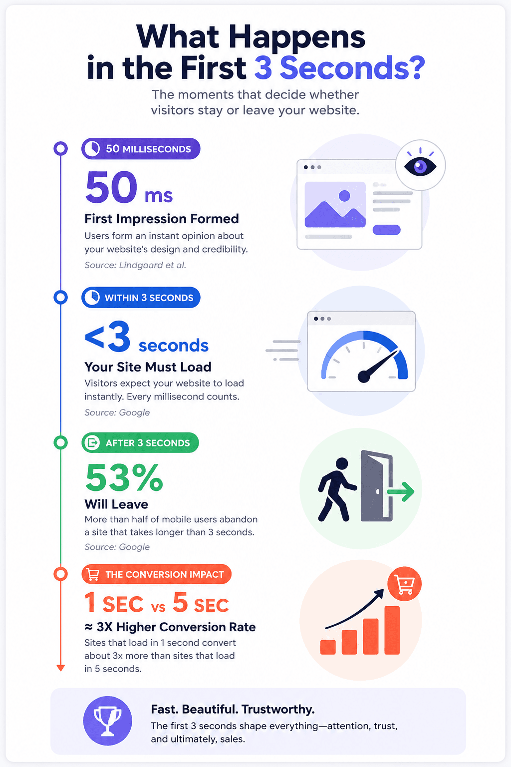
Your website has roughly 50 milliseconds to prove it deserves a visitor's attention. That is faster than a single blink. In that sliver of time, a potential customer has already decided whether your business looks credible or forgettable, and that snap judgment shapes everything that follows: whether they stay, whether they browse, and whether they buy.
For anyone selling online, first impressions are not a branding nicety. They are a direct revenue lever. Businesses that invest in those first few seconds consistently convert more visitors into customers than those that treat website design as an afterthought.
Why Visitors Judge Before They Read
The human brain is wired to process visual information far faster than text. When someone lands on your website, they are not reading your headline first. They are scanning layout, color, spacing, and imagery in a fraction of a second, then deciding whether the rest is worth their time.
Research backs this up convincingly. A landmark study by Lindgaard et al. found that users form aesthetic judgments about a website in just 50 milliseconds. Separately, Stanford's Web Credibility Research Project reported that 75% of consumers judge a company's credibility based on its website design alone. And according to data compiled by WebFX and Hostinger, 94% of first impressions are design-related, not content-related.
What this means in practice is that your copy, your pricing, and your product catalog are all invisible until the visual layer earns permission to be noticed.
The Three-Second Revenue Window
First impressions do not end at aesthetics. Speed plays an equally decisive role. Google's research found that 53% of mobile users abandon a site if it takes longer than three seconds to load. They never see the offer, the product images, or the checkout page. They simply leave.
The financial impact is measurable. According to Hostinger's 2026 analysis of web design statistics, retailers collectively lose an estimated $2.6 billion in revenue each year due to slow-loading websites. And the data is granular: sites that load in one second convert at roughly three times the rate of sites that take five seconds.
This is where the infrastructure behind your website matters as much as its front-end design. Choosing a reliable hosting provider with fast server response times is not a technical detail to delegate and forget. It is a conversion decision. Platforms like GoDaddy offer hosting plans with built-in performance optimization, and if you are setting up or upgrading your online store, you can find exclusive offers and discounts for GoDaddy that make professional-grade hosting more accessible for small businesses and solo entrepreneurs.
What Your Design Signals to Buyers (Before a Word Is Read)
Think of your website as a shopfront window. A cluttered, dated, or confusing layout communicates the same thing as a dusty physical store with flickering lights: something here is not quite right.
Visitors process specific visual cues almost instantaneously:
Visual Element | What It Signals | Impact on Behavior |
| Clean layout and whitespace | Professionalism and clarity | Increases time on page |
| Consistent brand colours | Established, trustworthy business | Builds subconscious credibility |
| High-quality original images | Authenticity and investment | 20% more engagement than stock photos |
| Mobile-responsive design | Modern, customer-focused operation | Accounts for 72.9% of ecommerce revenue |
| Clear call-to-action above the fold | Confidence and direction | Can boost conversions by up to 80% |
What stands out here is that 70% of small business websites lack a clear call to action on their homepage (Sweor). That is not a design oversight. It is money left on the table every single day.
A practical trust checklist for online sellers
Before your next site review, run through these essentials:
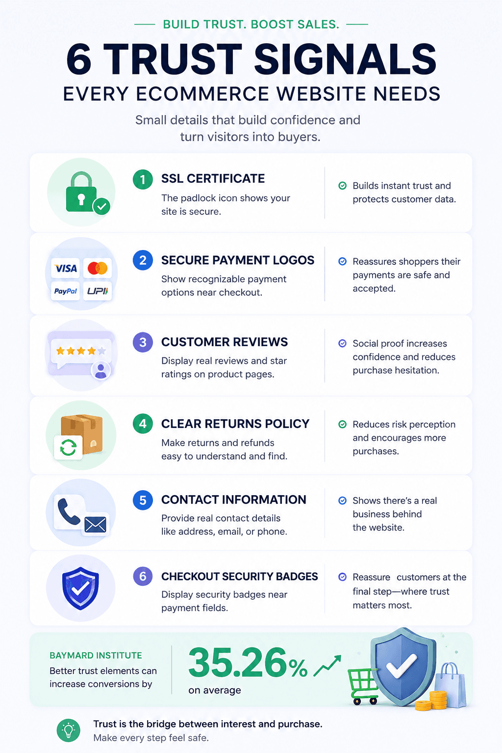
- SSL certificate visible (the padlock icon in the browser bar is non-negotiable)
- Recognized payment logos displayed near checkout (Visa, Mastercard, PayPal, UPI)
- Customer reviews with star ratings on product pages (a 4.2 to 4.7 average performs better than a perfect 5.0, per the Spiegel Research Center)
- Clear return and refund policy linked from product pages, not buried in the footer
- Real contact information including a physical address or verifiable phone number
- Security badges placed at checkout, not just in the footer where nobody looks
The principle is straightforward: trust signals should follow the buyer's path, appearing at every point where hesitation could kill a sale.
Why Mobile-First Is No Longer a Choice
Over 60% of global web traffic now comes from mobile devices, and Google indexes every website based on its mobile version first. A site that looks polished on a desktop but falls apart on a phone is not just frustrating users. It is actively being penalized in search rankings.
Mobile visitors are also less forgiving. Smaller screens mean less room for clutter, slower networks mean less tolerance for bloat, and thumb-based navigation means every misplaced button costs you a potential customer. If your mobile experience feels like an afterthought, your conversion rate will reflect it.
When building or rebuilding a site, choose tools and platforms that treat mobile responsiveness as a default, not an add-on. Website builders from providers like GoDaddy include mobile-optimized templates as standard, which removes one of the most common friction points for small businesses launching online.
What to Do This Week
You do not need a full redesign to start improving first impressions. Start with the changes that carry the highest conversion impact for the least effort:
- Test your page speed. Run your homepage through Google PageSpeed Insights. If it scores below 70 on mobile, address the flagged issues before anything else.
- Audit your above-the-fold content. Can a first-time visitor understand what you sell and what to do next within three seconds? If not, simplify.
- Add trust signals to your checkout flow. Security badges placed near payment fields reduce abandonment more effectively than badges in headers or footers.
- Replace stock imagery with original photos. Even smartphone-quality original images outperform generic stock by a significant margin.
- Check your mobile experience personally. Browse your own site on a phone as if you were a first-time visitor. Note every moment of friction.
Wrapping Up
The data is consistent and unambiguous. Visitors form opinions about your website in milliseconds, and those opinions directly shape whether they stay, trust you, and spend money. Design quality, page speed, mobile responsiveness, and strategically placed trust signals are not cosmetic upgrades. They are structural revenue drivers. The businesses that treat first impressions as a measurable, improvable system will consistently outperform those that treat their website as a set-and-forget brochure.
Frequently Asked Questions
1. How long does it take for a visitor to form an impression of a website?
Research shows it takes approximately 50 milliseconds. In that time, users have already judged the visual quality of your site and decided whether it feels credible enough to explore further.
2. Does website design really affect sales?
Yes, directly. Stanford research found that 75% of consumers judge a business's credibility based on its website design. Poor design not only loses attention; it actively erodes trust and reduces the likelihood of purchase.
3. What is the single most impactful change I can make to improve online conversions?
Page speed. Sites that load in one second convert at roughly three times the rate of those that load in five seconds, and 53% of mobile visitors leave if a page takes longer than three seconds. It is the highest-return improvement most businesses can make.
4. What are trust signals and why do they matter for ecommerce?
Trust signals are visual or textual cues, such as security badges, customer reviews, clear return policies, and recognized payment logos, that reassure visitors your site is legitimate and safe. The Baymard Institute found that optimizing these elements can increase conversions by over 35%.
5. How often should I update my website design?
Industry guidance suggests refreshing your design every two to three years to keep pace with evolving user expectations and web standards. However, performance metrics such as page speed, mobile responsiveness, and conversion rates should be monitored continuously.

Author
Rohit Shewale
I go the core of any topic and combine the best so that users don't have to look elsewhere once they are on my blog.