
Making a landing page that converts visitors into leads or customers isn’t hard. However, it does take work. It needs to look good and create a stellar first impression, as it marks the first crucial step at the beginning of the buyer’s journey.
A landing page can be your home page or any page on your website created for a specific purpose. You could use it to inform, sell, as a gateway to other pages, or for a myriad of other purposes.
Your landing page needs to be designed with your buyer persona in mind. This will vary from brand to brand, dependent upon your audience, niche, purpose, product, intent, industry, and value proposition.
To unleash your landing page, give customers what they want. Your goal needs to be to increase conversions and ultimately your revenue. If you want your landing page to align with your business growth goals, there are a few common landing page mistakes you need to avoid, whether in the design, code, or copywriting.
You cannot have your visitors confused, disoriented, or frustrated for even a millisecond, lest they leave your website.
Source: Pixabay
The following eight landing page design mistakes should be avoided to create an effective landing page design, convert more leads, and turn traffic into money.
1. Slow speed
Web traffic analysis uses bounce rate to analyze what percentage of visitors land on your page but leave without moving on to other pages or performing an intended action. The slower your landing page loads, the higher your bounce rate will be.
Site loading speed is a critical factor in keeping users engaged. The longer they wait, the faster they exit. As the loading speed goes from one second to 10 seconds, the bounce rate increases by 123%.
So, do not underestimate the importance of website loading speed! Every second or millisecond counts and is the difference between a site that is optimized for conversions and one that is not. Especially if you have an eCommerce website, loading times are critical to the purchase ordering process.
You can reduce your bounce rate by doing the following:
1. Testing your speed
2. Cleaning your code
3. Resizing and compressing images
4. Reducing redirects
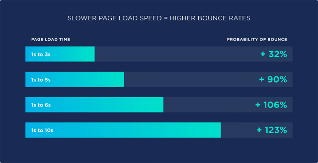
Source: Backlink
2. Headlines Are Nondescript
The headline is the most important part of your landing page. It’s the first thing that will load and the deciding factor in keeping people on your page. You need it to tell them if they are in the right place and convince them to scroll further.
Can you solve a customer’s pain points? Do your products or services exist to solve a problem they’re suffering? What is it you can do for them? These are the questions they want answers to. They do not care about the creativity in your headline, only whether it gives them hope that their pain will be alleviated.
Headlines should inform and should not be vague about your business purpose. Nondescript headlines that are creative but do not tell customers what your business does will not work.
Let’s say you have a website for your telecommunication software and cloud storage business. As a B2B business, you have a number of landing pages to inform clients about several of your products, like ‘what is hybrid cloud’ or ‘how does voice over internet protocol work’.
You need to be able to engage your web visitors with copywriting and images long enough for them to understand what your products and services are. The first step in this attempt should be a benefit-driven headline that is concise and targets your audience directly.
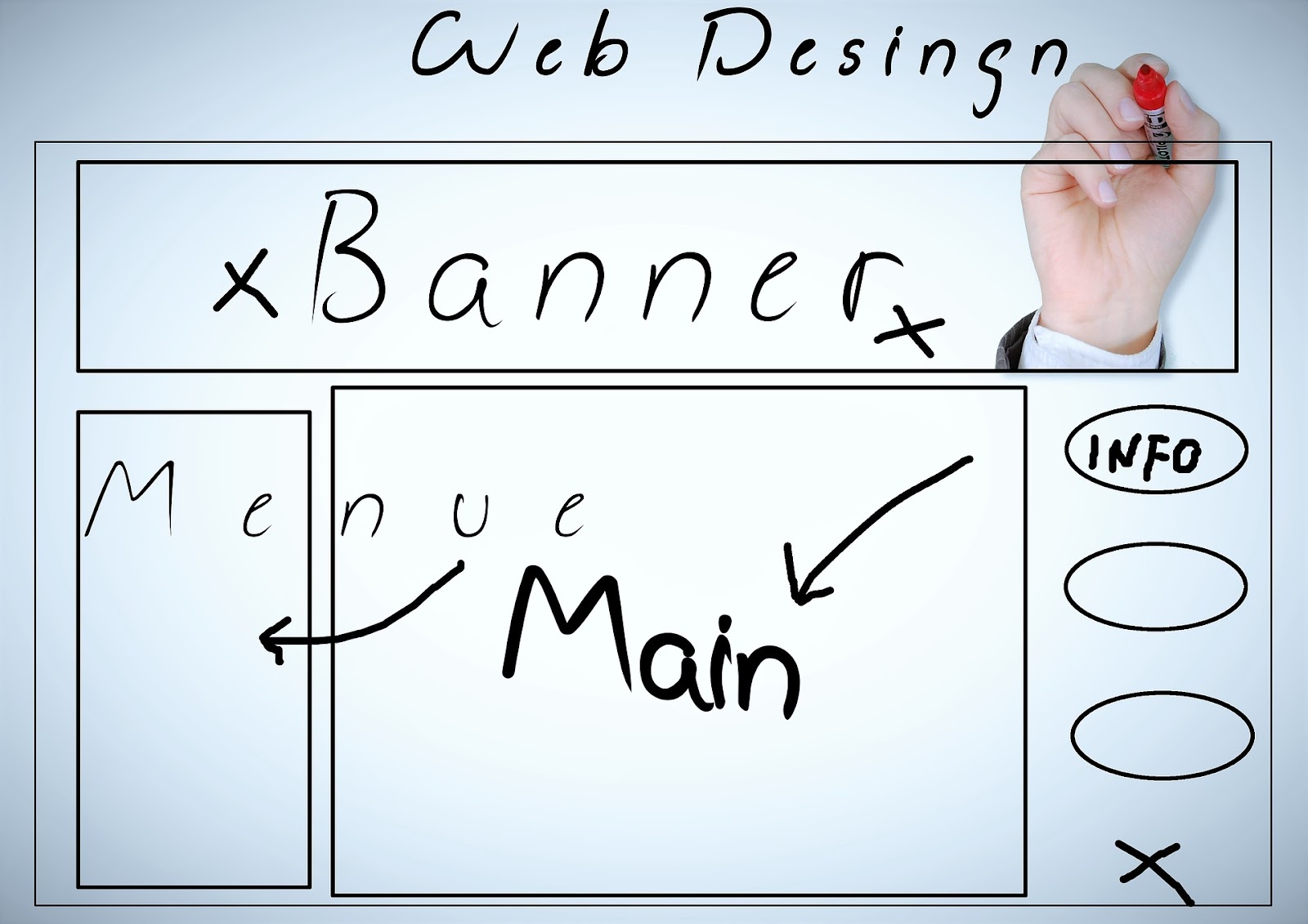
3. Clutter
An effective and responsive website design is as clutter-free as possible. This can only be engaging and eye-catching if it is simple and helps users focus on the important content that can convince them to take action.
Try to avoid giving the user a choice; your landing page needs to have a single, specific objective and be able to push visitors to the next area of your website. Every element in your design needs to cater to this purpose. It should take users less than a second to understand the point of your page and how it’s to their advantage to do what you want them to.
Back to the example of our communication software provider. If their VoIP phone landing page has testimonials and product images, they should not make these the focus of their landing page.
Instead, they should break up text and use bullet points and shorter sentences to cater to the user’s fleeting concentration span. They should also minimize distractions and complicated layouts to focus attention on the most important parts of their page.
Source: Pixabay
4. Distracting Visuals
Our last point explained why simplicity is key to effective website design. Having images that have little to do with your business will only distract users from the page’s purpose. Distracting images are conversion kryptonite. They create resistance among customers as they move through your sales funnels.
The web is all about efficiency and you need imagery that enhances your web design instead of confusing your customer. Use photos of people instead of random images of things. These can be used intelligently to convince visitors to heed your call to action. For example, images with people looking in the direction of your call-to-action (CTA's) help promote conversions.
5. Weak CTA
As you lead customers down the sales funnel, the best way to nudge them further is by using a call to action on your landing pages. CTAs need to be convincing and have to stand out. Otherwise, they defy their purpose. The color of your CTA needs to be different than the color scheme of the rest of your website. It should be bright and obvious.
The size of your CTA button is a key feature in determining the attention it gets. Online store trends for CTA buttons these days are big bold letters that say “Add to cart”. The button isn’t giant but is big enough to remind the buyer they can purchase the product right away.
6. No Social Proof
Social proofs like product reviews and customer testimonials play a huge role in convincing potential purchasers. They’re critical in establishing trust and play a big role in increasing conversions on your landing page. Customer testimonials make for intelligent conversational marketing.
If the communication software provider from our previous example wanted to convince their web visitors about the benefits of video conferencing software, they might include a customer testimonial that details ‘what is teleconferencing’ and how it has helped the customer and made their life easier.
Customer testimonials are a trust indicator and help build your reputation.
7. Forms Not Designed For Conversions
Lead generation firms need to be designed with the user, their attention span, and their convenience in mind. Lengthy forms with numerous fields are ineffective in their aim to gather customer data. Consider the following tactics to improve the conversion rate of your forms.
1. The positioning of your form on your landing page should make it easy to find. Visibility is key to drawing attention to it.
2. The lead form's length will decide the tradeoff between the quantity and quality of the leads you generate. A shorter form will generate more leads with less data, and longer forms will have fewer but higher-quality leads.
3. Decide what your form fields should be depending on what information is necessary for your business, industry, and niche. You should collect information that helps you contact and convert the lead.
8. Not Optimized For Mobile
Websites are usually designed for desktops and laptops, but mobile users now account for the majority of visitors. To not optimize your site for mobile is therefore foolish, as it’s expected to account for more than half of all eCommerce sales by 2021. A poor mobile experience can negatively affect conversions and make it unlikely for users to return to your website.
Improving the mobile experience should be a priority for all website designers. Robotic process automation (RPA) has made chatbots a key feature of most landing pages. However, with the limited screen space available on mobile screens, chatbots and other elements need to be added intelligently so the user experience is enhanced.

Source: Pixabay
The Takeaway
Just as websites are audited regularly to avoid cybersecurity threats, they need to be A/B tested often to pinpoint the best option for various design elements. A website that is straightforward, distraction-free, and has an actionable CTA will be able to convert the maximum visitors.
Avoid the eight errors listed above to optimize your landing pages for conversions and leads. Gently guide visitors down the sales funnel without overloading the content or giving them too many choices. We live in a short-attention-span economy, and you need to grab a visitor and engage them in a seamless, friction-free user experience from the off.
About The Author

Sam O’Brien - RingCentral UK
Sam O'Brien is the Director of Digital and Growth for EMEA at RingCentral, a Global VoIP, video conferencing, and call center software provider. Sam has a passion for innovation and loves exploring ways to collaborate more with dispersed teams. He has written for websites such as G2 and Hubspot. Here is his LinkedIn.


