The Product Photo Mystery: Why My Beautiful Images Weren't Selling Anything?
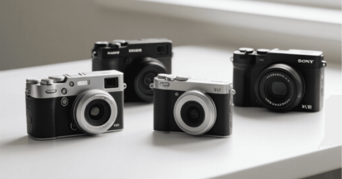
I did everything the internet told me to do. I studied the gear forums. I bookmarked hero shots. I even researched the cameras serious creators swear by — flagship compacts like the Fujifilm X100VI that make every product look like a magazine cover. Then I took better photos than my store had ever seen… and my conversion rate didn't move. Not one decimal point.
That's when the mystery began. If the photos were better, why wasn't anything selling? What follows is the investigation I ran on my own product pages — and the uncomfortable answer every store owner should hear before spending another dollar on gear.
Why Product Photos Still Decide Everything in 2026
Here's the part nobody argues with: shoppers can't touch, hold, or try your product. Your images are the product, until the box arrives. One survey after another says the same thing — photos are the number-one influence on whether a visitor clicks Add to cart or quietly leaves.
So why do two stores with identical products and identical cameras get wildly different results? That question kept me up at night. The answer, I'd soon learn, had nothing to do with the camera.
What Shoppers Actually Look For (It Isn't Megapixels)
I started watching session recordings of real visitors on my product pages. And a pattern emerged that felt almost embarrassing in hindsight. People zoomed in. Every single one of them. They zoomed into seams, textures, labels, ports, stitching — the details that answer the question your product page never addresses out loud: is this actually good quality?
My photos were beautiful at arm's length and blurry under scrutiny. The shopper's doubt lived in the zoom — and I had been optimizing for the thumbnail. That was clue number one.
The Day I Stopped Blaming My Camera
The turning point came when I A/B tested my old, 'amateur' phone photos against the new glossy ones. The difference was smaller than my pride wanted to admit. The photos weren't the bottleneck — the information was. Shoppers didn't need prettier pictures; they needed answered questions: scale, context, texture, and proof.
So I changed the mission. Instead of asking how do I take a better photo? I started asking what doubt does each photo need to kill? Everything after that got easier.
Getting Up Close: When Macro Detail Closes the Sale
Some categories live or die at one centimeter. Jewelry, fabrics, electronics, skincare textures — if your shopper can't see the detail, they assume the worst. This is where unusual gear earns its keep. A dedicated macro device like the Littpopo MicroCam X1 can reveal textures no phone can get near — and for detail-driven products, that extreme close-up is often the exact image that converts a skeptic.
The lesson isn't 'buy a microscope.' It's this: identify the one detail your customer needs to trust, and shoot it closer than feels reasonable.
Photos and Video: One Setup, Two Assets
Modern product pages don't choose between photos and video — shoppers expect both. The good news: the same lighting and background that fix your stills fix your clips. A 15-second rotation video answers questions a dozen stills can't: weight, movement, scale in a hand.
My rule became simple: every product gets five stills and one motion clip. Not because the algorithm likes it — because the recordings showed me people pausing on the video longer than anything else on the page.
The Distance Between 'Nice Photo' and 'Add to Cart'
Here's the twist the mystery kept hiding from me: images don't convert in isolation. They convert inside a page. A stunning photo next to a thin description, zero reviews, and a slow mobile layout still loses — because trust is built by the whole page, not the hero shot.
Once I saw it that way, the fix expanded: sharper zoom-crops next to benefit-driven copy, customer photos mixed into the gallery, and a layout fast enough that nobody bounced before believing me. The camera got less credit. The page got rebuilt.
The Product Photo Checklist That Fixed My Store
If you only take one thing from this investigation, take the checklist. Run every product page through it — it's the difference between images that decorate and images that sell:
- The zoom test: zoom to 200% on mobile — can a shopper inspect the detail they'd touch in a store?
- The scale clue: is there at least one in-hand or in-context shot showing real size?
- The doubt map: does each image answer one specific objection (quality, fit, texture, contents)?
- The proof layer: are real customer photos visible near the buy button?
- The motion asset: is there a short clip showing the product moving or being used?
- The speed check: do images load fast on mobile, compressed without visible blur?
- The consistency rule: same background, light, and angles across the catalog?
Seven checks. Ten minutes per product. The conversion lift paid for itself in a week.
So was my camera the problem? Never. It was the last piece I should have touched. The mystery solved itself the moment I stopped shooting for photographers and started shooting for doubters. If you do decide to upgrade, upgrade for how you actually shoot — many store owners love pocketable tools like the Ricoh GR IV for lifestyle and lookbook shots because it disappears into a jacket pocket.
But remember: photos only convert when the page around them is built to earn trust. That's why I run my store on a conversion-first foundation like the Debutify Theme — fast pages, proven layouts, and review widgets that turn your happiest customers into your best photographers. Fix the doubt, and the photos finally get the credit they deserve.

Author
Sophia Wilson
Sophia Wilson is a professional Guest Post & SEO Specialist with over 4 years of experience in digital marketing and link building. She specializes in high-quality guest post placements, authoritative backlinks, and SEO-friendly content that helps businesses improve their online visibility and search rankings.