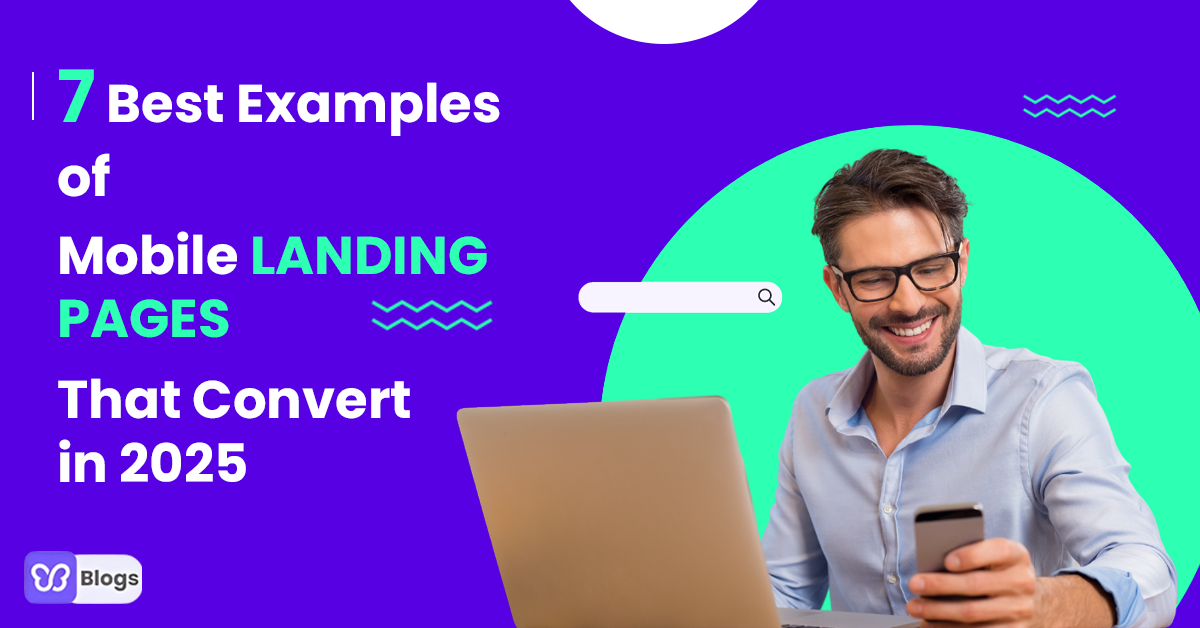
Are you wondering what a mobile landing page is?
Then imagine this...
You're lying in bed because you're tired from work.
Suddenly you thought of going on a relaxing vacation...
But you're too lazy to use your laptop, so you open your phone...
Then when you open a website to plan your trip...
Then BAM!
You can't press the buttons properly.
It's loading very slowly.
And it's so hard to navigate on it.
Uhm... major turn-off, right?
That's how your customers will feel if you don't have a mobile-responsive landing page.
But... what is a mobile landing page? Let's dive deeper.
What is a Mobile Landing Page?
A mobile landing page is where your website visitors will land if you drive them to your website. But the thing is, these visitors are using mobile.
You can say that it's the same as the usual landing page on a desktop. But again, these are specifically optimized for mobile users.
And that's what I'm going to help you with.
I will tell you the benefits of having a mobile landing page. But that's just the tip of the iceberg...
Because I will also show you 7 best examples of mobile landing pages. Not only that, because I'm going to tell you what makes them the best. And how you can improve your own mobile landing page!
So again, a mobile landing page is where you're redirecting your customers who are using mobile devices.
Now, let me tell you why you need a mobile landing page.
Why Do You Need A Mobile Landing Page?
1. Enhance user experience
Did you know that mobile devices are responsible for 54.8% of global website traffic in the first quarter of 2021?
That's a lot!
It's because mobile phones are more convenient for some. So, having a mobile-friendly landing page improves your customer's experience.
And if you're not yet planning to make your website mobile responsive... you're driving potential customers away.
You don't want that to happen, right?
Still in doubt? Did you know that having a mobile landing page can help...
2. Increase conversion
Let me tell you a piece of information: Mobile conversions are 64% up than desktop conversions.
Whoa. That's HUGE! Right?
That means... you need to have a mobile-friendly landing page that drives your visitors to conversion!
If your website is easy to navigate on mobile, your visitors can have a smooth transaction.
That's why if you have a mobile-friendly landing page, you increase your conversion rate.
And as a business owner, one of your goals is to generate sales.
So, if your mobile landing page UI (User Interface) is responsive, you can drive more sales!
Next is...
3. Customer retention
What if I tell you that you can retain customers if you have a mobile-responsive website?
Because if you give them an excellent customer experience, it will positively affect their loyalty.
The best part? They can be your brand advocates! And they would want to refer you to their friends.
Do these reasons sound amazing?
If yes, let's get this show on the road and see the best mobile landing pages!
7 Best Examples of Mobile Landing Pages
1. Wix
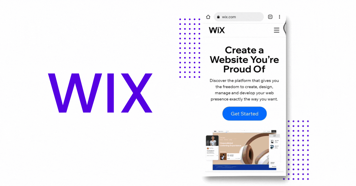
One of the best mobile landing pages example is Wix.
If you want your visitors to take further action on your website, make their stay worthwhile. Your website should make them sign up for your services or buy your products.
Let's see how Wix does it:
- Use of whitespaces. Wix utilized its whitespaces, making its mobile landing page simple and easy on the eye.
- Call-to-action. You can clearly see the big "Get Started," which also pops out because of the color.
- Clear copy. The copy is short but crystal clear. Wix wants you to create a website you're proud of, and you can do it with them.
Wix proves that you don't need too many designs on your website. Simple navigation, clear copy, and a call-to-action are enough for your visitors.
Another example I have for you is...
2. Manychat

Manychat has a simple mobile landing page that aims to make its visitors take the next step.
Let's see why they stand out when it comes to implementing mobile landing pages best practices:
- Clear description. Manychat clarifies what they do and how they can help you. It also states how their services can grow your business.
- Clear call-to-action. Their clear call-to-action can entice visitors to sign up. As you can see, it says, "Get Started Free."
- Simple layout. There's also not much happening on their mobile landing page. You can see their creative headline, services, description, and CTA.
And if you scroll down further, Manychat makes it easier for their visitors to take the action they need.
Hold on, I have another one.
3. Paypal
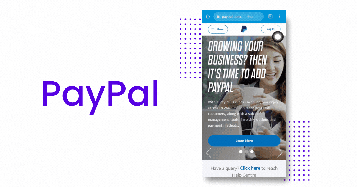
Since we're talking about the best converting mobile landing pages, Paypal can be one of them.
And I have reasons:
- It shows how Paypal will benefit you. You can see that they're telling you how you can use Paypal. It says that you can shop seamlessly and safer at home.
- It shows how Paypal works. If you scroll down a little bit, you can see a 3-step process, making it easier for their visitors to understand and sign up on their platform.
- It includes a call to action. The call-to-action button stands out because of the color contrast. And it's also not hidden anywhere else.
If you think they're doing a fantastic job, let's take a look at another example.
4. Airbnb
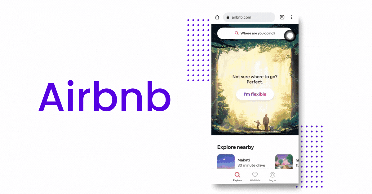
Did you know that 48% of mobile users in the US are planning an entire trip using their smartphones? And that already includes researching and the actual booking.
That's a significant number, right?
That's why Airbnb makes sure that their visitors will book on their website! And here's how they do it:
- Asking a question. Airbnb asks its website visitors a question they can relate to, which they can answer using the...
- Unique call-to-action button. "I'm flexible" is such a unique way to ask if your customers are ready to book their adventure.
- Convenient search bar. Visitors can easily click the search bar, which redirects them to possible places they can visit.
See, Airbnb is so easy to navigate!
Let's take a look at the next one!
5. Lyft
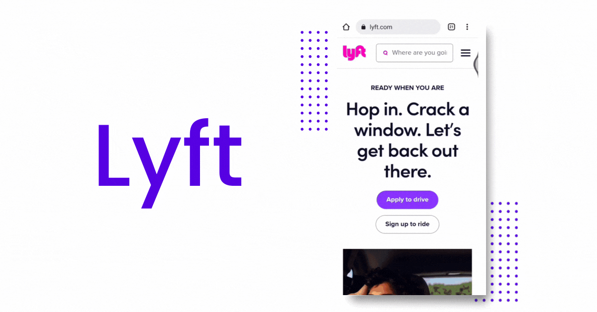
Lyft is probably of the best converting mobile landing pages.
Let me tell you why...
- Good search bar placement. Visitors can easily navigate through the search bar. They can type where they're going and be redirected to another page where they can pinpoint the location.
- Easy navigation and call-to-action. If their website visitors want to apply to drive, they can easily find where. While if some want to ride, there's also navigation below the first one.
- Simple layout. It has a simple but very informative structure. If you scroll down a bit, you can see how being a Lyft driver can benefit you.
They minimized the details of their mobile landing page, leaving what matters to their website visitors.
My next example is...
6. Bose
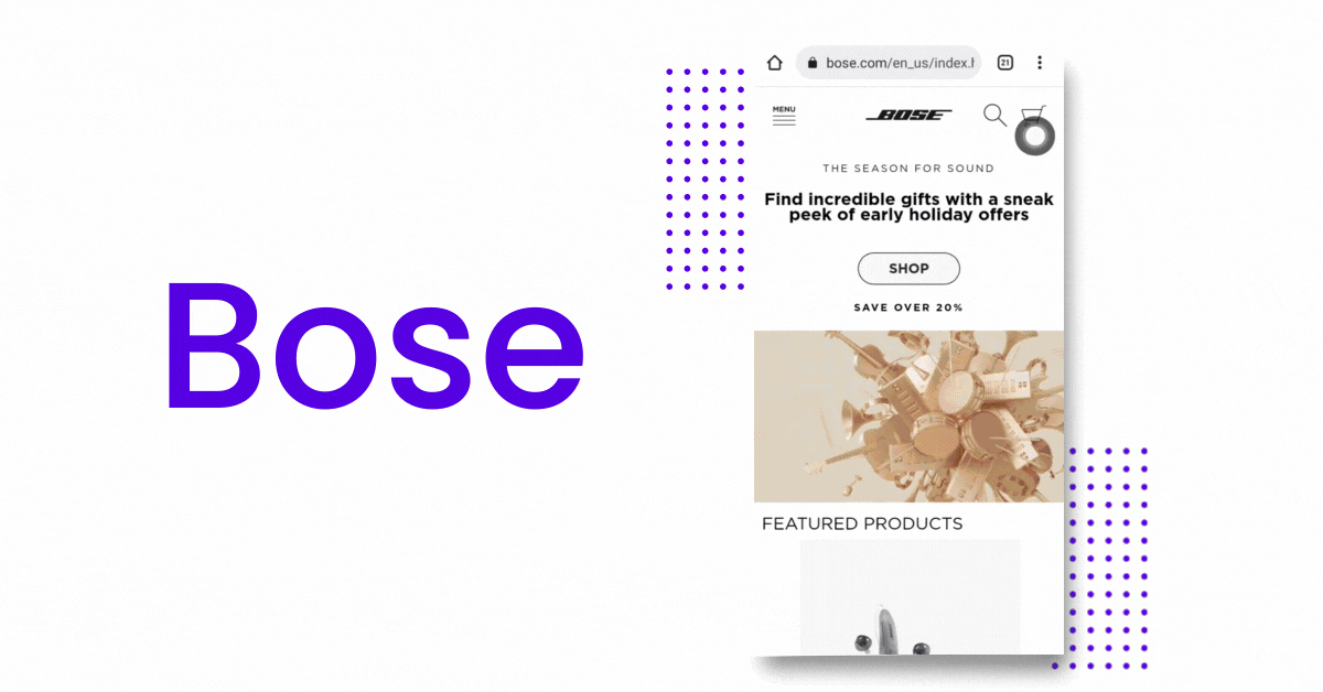
Bose highlights that there's an astonishing sound wherever life takes you.
And you can see below the headline that they have a new bluetooth speaker product.
- Creative copy. Bose has a short but creative headline. "Wherever life takes you" shows you can take their products wherever you are. And that is a product benefit, right?
- Featured products. You can already see their new and featured products on their landing page, which invites buyers to shop.
- Shop button. Despite having its products on the landing page, Bose makes sure that its "Shop" button stands out. It's in the center with a contrasting, eye-catching color.
Now, let's get into the next one...
7. Shopify
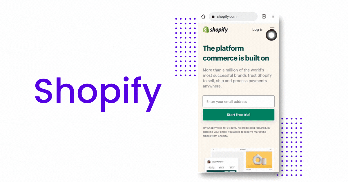
Shopify doesn't want its website visitors to have a hard time navigating their mobile landing page. That's why they already put an email form to start their free trial.
This is genius, right? Imagine, what you need is already right in front of you!
And because of how easy this is, they can easily have their visitors sign up.
So, what makes Shopify one of the best converting mobile landing pages?
- Sign up form. Shopify's landing page makes it easy for its visitors to convert into customers quickly. How? Because of the sign-up form right at their landing page. Their customers don't have to navigate elsewhere.
- Short copy. You can clearly see that their copy is brief but informative. It tells about their credibility and how you can use Shopify. It's because they emphasized that you can sell, ship, and process payments through their website.
- Call-to-action. Their call-to-action says, "Start a Free Trial," now tell me... who doesn't like free things?
Now that you have some ideas of the best mobile landing pages example.
The question is... how can you implement these mobile landing pages' best practices?
Here's what we can learn from them!
Best Mobile Landing Page Practices

1. Page speed is important
Even if your visitors are using a desktop or mobile, page speed is very important.
What if I tell you that your visitors will leave your website if it's loading slowly?
Hmm...
If you want to convert that 64% of smartphone users who want to purchase from websites that load fast, optimize your page speed.
Let me show you how:
- Use a fast-loading theme. You're lucky because there's a one-click Shopify theme that loads fast whether your visitors are on mobile or desktop. So convenient, right?
- Don't use large images. Well, this might be unavoidable. But if you do, make sure to compress your images.
- Test your site. Your landing page is what your visitors will see first if they click a specific link. So, make sure to test it because first impressions last!
So, if you don't want to lose sales... make them stay on your website.
2. The shorter copy, the better
Trust me, the attention span of internet users is getting low.
If you write a long copy, they won't read everything.
So if you want to engage your website visitors, I have a few tips:
- Make it short but clear. Again, they wouldn't read everything.
- Call them out. Write as if you're talking to your visitors.
- Tell them how you can solve their problem. This is how you can convince them!
Remember, the shorter copy, the better!
3. Easy navigation
If your customers can't explore your website conveniently, they might just leave.
Yes, you will lose customers if you don't have an easy navigation bar!
Oh, no! What to do?
- Take note of your navigation placement. Put your navigation bar where it's easy to see.
- Think of your mobile landing page size. Make sure everything is clickable.
- Put in the most important categories. These include the About, Products, Services, Pricing, and Contact pages.
It doesn't sound complicated, right?
Now, let me show you how to...
4. Make it simple
Consider your mobile landing page size. It's smaller than a desktop, so you have to keep it clean.
Don't overwhelm your visitors with designs and elements all over the place. Make it easy on the eye so they can process information better.
Let me give you some tips:
- Use whitespaces. Leave some space with no images or text.
- Use up to three fonts. Don't bury your visitors with too many fonts.
- Use a consistent color palette. To keep it simple, use a consistent color palette. This will also make your brand identity more robust.
So, if you want your visitors to have a great time browsing your mobile-friendly landing page... make it simple!
And this leads me to my last tip...
5. Lead them to conversion
You should lead your website visitors to one place only...
And that is the "Check Out" page!
My best mobile landing pages examples show that they aim to make the visitors buy or sign up on their platforms.
That's why I will give you some tips on how you can do this, too.
- Add conversion triggers. These will prompt your visitors to buy!
- Promote your products. On your landing page, make sure to mention how beneficial your products are. And if possible, show them the actual products.
- Show testimonials. You can add testimonials or reviews on your landing page. Your visitors seeing that your customers love your products will convince them to buy.
Think that's all? No!
I have a bonus tip for you...
Have A Mobile-Responsive Theme!
What if choosing a mobile-responsive theme makes you win half the battle already?
Very convenient, right?
Because you can just focus on other things that matter to your business!
That's why you need a mobile-responsive and fast-loading theme.
But wait... where can you find this gem?
You're lucky to be here because you're in for some treat!
Debutify offers a highly responsive mobile theme for your website.
It also has 50+ add-ons to make your ecommerce store attract more customers!
Don't believe me yet? Well, you can try it FREE for 14 days!
Create Your Mobile-Responsive Website With Debutify - Today!
14-Day Free Trial. 1-Click Installation. No Credit Card Needed.