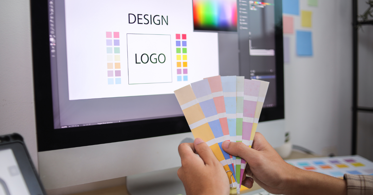
In the world of effective landing page examples, understanding the role of color in user engagement and conversion is essential for professionals and remote workers alike. Color plays a critical role in how we perceive the world around us, impacting our emotions and influencing our decisions.
Throughout this blog post, we will delve into the importance of selecting appropriate colors for your landing pages to enhance user engagement. We'll explore how different colors evoke psychological associations that can either attract or repel site visitors.
Moreover, we will examine the crucial role that color plays in driving conversions by analyzing various successful landing page examples. By implementing strategic color choices based on sound principles such as contrast and harmony, you can optimize your marketing efforts to drive sales effectively.
Importance of Color in a Landing Page
Using color in a landing page is an essential aspect that can significantly impact user engagement and conversion rates. Color plays an essential role in guiding users' attention, creating emotional connections and influencing their decision-making process, all of which are vital to the success of a landing page. In this section, we will discuss the importance of color in landing pages and how it contributes to a better user experience.
Creating Visual Hierarchy with Colors
A successful landing page design should have a clear visual hierarchy that effectively guides users through its content. Using colors strategically allows you to create contrast between different elements on your page and draw users' attention to key information or calls-to-action (CTAs).
For example, using bold colors for headlines or buttons can make them stand out from other elements on the page while maintaining consistency with your brand's identity.
Influencing Emotions and Perceptions
Different colors evoke various emotions and associations among people due to cultural backgrounds or personal experiences. Therefore, picking the right hues for your landing page can help create an emotional bond with your intended demographic by expressing particular sentiments such as trustworthiness (blue), enthusiasm (red), or imagination (purple).
Achieving Consistency with Brand Identity
Maintaining consistency between your brand's identity and the colors used on your landing page helps create a cohesive user experience across different marketing channels. Using colors associated with your brand can reinforce brand recognition and establish trust among potential customers.
In summary, understanding the importance of color in a landing page design allows you to create visually appealing pages that effectively engage users while guiding them toward desired actions such as signing up for newsletters or making purchases. Utilizing strategic use of colors contributes significantly to improved user engagement, conversion rates, and overall success of online marketing campaigns.
The significance of hue in a touchdown page is paramount, as it can immensely affect user involvement and transformation. Investigating the potency of color, let's look into how colors shape human mental states.
Overview of the Impact of Color on Human Psychology
The impact of color on human psychology is a fascinating topic that has been studied extensively. It's no surprise that colors can evoke emotions, create associations, and influence our behavior. In this section, we will delve into how different colors affect user behavior and explore some common associations with various hues.
Color Associations and Emotions
Different colors have distinct psychological effects on people due to their cultural significance or natural associations. Here are some examples:
- Red: Often associated with passion, excitement, urgency, and danger. Red can stimulate appetite as well. This makes it an ideal choice for restaurants or businesses looking to create a sense of urgency in promotions.
- Blue: Conveys trustworthiness, stability, calmness, and professionalism. Many financial institutions use blue in their branding because it evokes feelings of security (source).
- Green: Associated with nature and growth; often used by eco-friendly brands or companies promoting health-related products/services.
- Purple: Represents luxury and sophistication; commonly found in high-end products such as jewelry or cosmetics.
- Pink:: Evokes feelings of warmth and affection; frequently used by brands targeting female audiences or promoting romantic themes.
Effective Landing Page Examples
Let's take a closer look at some effective landing page examples, focusing on their strategic use of color to enhance the overall experience.
Toptal: A Successful Landing Page Example
This landing page is an excellent example of how color can be used effectively in web design. The main colors used are blue, white, and black, which create a professional and trustworthy appearance while also drawing attention to key elements such as headings and calls-to-action (CTAs).
- Blue: Associated with trustworthiness, reliability, and professionalism. In this case, it helps establish Toptal as a credible source for hiring top talent.
- White: Creates contrast against the blue background while providing ample whitespace for easy readability.
- Black: Used primarily for text content but also adds depth to the overall design by creating visual hierarchy through typography weight variations.
Duolingo: Engaging Users Through Colorful Design
Another great example is the popular language learning app Duolingo's homepage. Duolingo uses bright green as its primary brand color combined with playful illustrations that showcase different languages being taught on their platform. This approach creates an engaging environment that encourages users to sign up or log in.
- Bright Green:: Represents growth and progress - fitting for a language learning platform.
- Playful Illustrations:: Adds a sense of fun and excitement, making the learning process more enjoyable for users.
Shopify: Guiding Users with Color Contrast
The e-commerce platform Shopify's homepage is another example of effective color usage in landing page design. The three hues employed are white, black, and green, producing a contrast that helps direct users to the significant components such as calls-to-action and cost packages. These colors create a contrast that guides users' attention to key elements such as CTAs and pricing plans.
- White:: Provides ample whitespace for easy readability while contrasting against darker elements on the page.
- Black:: Used primarily for text content but also adds depth to the overall design by creating visual hierarchy through typography weight variations.
- Bright Green:: Draws attention to important actions like signing up or starting a free trial - essential for driving conversions on an e-commerce platform like Shopify.
Overall, effective landing page examples create user engagement and increase conversions. In conclusion, the role of color in these pages is essential for success; thus, understanding how it impacts users should be a top priority.