Let me guess—you’ve probably seen a pricing table a hundred times. But did you know most people’s brains are wired to hate confusing ones? Seriously, the last thing you want is to lose a potential customer because your pricing table is a headache to read. Well, we’re about to change that.
E-commerce Tips & Tricks
7 min read
14 Oct 2024
How to Build a High-Converting Pricing Table for Your Website
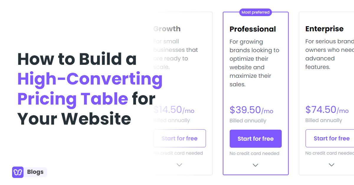
Table of Contents
- The Truth About Pricing Tables
- Why Pricing Tables Are So Important
- First Things First: Keep It Simple
- Show What They'll Get
- Use the Power of Three
- Make It Visually Appealing
- Anchor Pricing – A Smart Trick
- Add Testimonials and Trust Signals
- Mobile-Friendly Matters
- The Decoy Effect
- Offer Limited-Time Discounts
- Comparison Grids
- Bonus Tips:
The Truth About Pricing Tables
You’ve probably heard that a well-crafted pricing table can boost conversions. But here’s something that’ll surprise you: customers abandon purchases when pricing is unclear or too complex.
Think about that for a moment. That’s a massive chunk of your hard-earned traffic walking away.
So, what is a pricing table? Simply put, a pricing table is a clear, organized way to present your product or service options. It shows the prices and list of features side-by-side.
And if you build a high-converting pricing table, don't just throw some numbers on the page. You need to have a strategy. Plus, you need to consider clarity, psychology, and design. Let’s dive into how you can create a beautiful pricing table that works.
Why Pricing Tables Are So Important
Your pricing table is where decisions happen. It’s the moment when your customer says, “Yeah, I’ll buy.” Or... they leave.
If it's too confusing, people will bounce. If it’s too plain, they’ll skim right past it.
You need something that grabs attention, holds interest, and makes the decision easy. Think of it as a roadmap—one that should lead directly to purchase.
It’s like going to a restaurant and getting a confusing menu. You wouldn’t order, right? That’s exactly what a messy pricing table does to your customers.
First Things First: Keep It Simple
The first rule of a great pricing table? Simplicity. When people are bombarded with too many choices or too much information, their brains freeze.
Don’t make your customers do mental gymnastics. Each option in your pricing table should be clear and easy to compare.
Here’s a simple trick: Put the most popular choice or recommended plan in the middle. That’s where most people’s eyes naturally fall. And make sure to highlight it.
This little psychological trick can steer customers toward the option you want them to pick without making it feel forced.
Show What They'll Get
Here’s a fact that most websites gloss over: People want to know what they’re really getting. So, spell it out.
Start by showing what is included in each. What perks do they get? Be transparent. Let them know why paying a little more for the premium option is totally worth it.
Take a look at this pricing table of Zeuss for their TRT treatments. Each treatment plan clearly presents the price and its inclusions.

Use the Power of Three
Ever heard of the rule of three? When you offer three pricing options, it makes decisions easier. Why? Because it gives customers a natural point of comparison.
Remember, the brain loves simplicity, and three choices feel just right. Think of it like this: When presented with three cups of coffee—small, medium, and large—most people will go for the medium. It feels safe.
Your pricing table should follow the same idea. Offer a basic plan, a premium one, and one in the middle. The mid-price choices are what most customers will gravitate toward.
Make It Visually Appealing

A lot of people think that pricing tables need to be packed with information. But here’s a secret: People are drawn to design first, content second.
In fact, 75% of consumers judge a business’s credibility based on design alone. That means your pricing table needs to be easy on the eyes.
The best pricing table designs are simple, clean, and visually organized. Keep the layout neat, use bold headings, and choose colors that complement your site.
If your pricing table looks chaotic, people won’t bother reading it. Make it look inviting and straightforward.
Anchor Pricing – A Smart Trick
Have you ever seen a super expensive option that you’d never buy, but suddenly the next one down looks like a bargain?
That’s called price anchoring. It works like this: Start by offering a super premium option at a higher price. This way, your mid-tier option looks like a steal in comparison. It’s sneaky but effective.
Many eCommerce giants like Amazon use this trick. And it’s simple to implement. Just add a high-priced option that makes your main offering look much more attractive.
Add Testimonials and Trust Signals

Let’s face it—people are skeptical. Your customers want to be sure they’re making the right decision, especially when it comes to pricing.
That’s where testimonials come in. Add customer reviews or logos of brands that use your service right next to your pricing table.
Studies show that 84% of people trust online reviews as much as personal recommendations. That means adding a few glowing reviews can seriously boost your conversions.
Mobile-Friendly Matters
Did you know that 60% of eCommerce sales happen on mobile? That’s why it’s crucial your pricing table looks great on any device.
If it’s hard to navigate or doesn’t load properly on mobile, you’ll lose a huge chunk of potential customers. Test your pricing table on multiple devices and make sure it’s responsive.

If you're using Debutify Theme, you're in luck! It comes with a pricing table widget that's simple and mobile-friendly.
The Decoy Effect
Here’s a trick most eCommerce websites don’t talk about—leveraging the decoy effect in your pricing table. What’s that? It’s when you create an option that’s intentionally less attractive.
As a result, customers are more likely to pick the “better” option. This works especially well when you have three pricing tiers.
Let’s say you have three plans: Basic, Standard, and Premium. If the Standard plan is priced just slightly more than Basic but offers significantly more value, customers will be nudged towards picking Standard because it feels like they’re getting a deal.
Meanwhile, Premium seems like a luxury, but it serves to make Standard look even better in comparison.
This subtle use of psychology can drive your customers to the product or plan you want them to choose. All that without them even realizing it.
Offer Limited-Time Discounts

Ever heard of FOMO (Fear of Missing Out)? It’s a huge driver of sales. One way to take advantage of FOMO is by offering limited-time discounts on your pricing table.
Customers are more likely to buy if they think they’re getting a deal that won’t last. You can add a small note or countdown timer that says something like, “Special pricing available for the next 24 hours!”
This little addition can increase urgency and push customers to act faster. A simple pricing tweak like this can do wonders for conversions, especially if you’re running a promotion or sale.
Comparison Grids
Another feature many websites forget to include is a comparison grid. This is different from the main pricing table but works alongside it.
A comparison grid lets customers easily see which features they’re getting with each pricing tier. It makes things crystal clear for the customer and helps them justify spending a bit more on a higher plan.
Let's consider our example earlier, Zeuss. If a user is not sure what TRT treatment is best, their comparison table might help.

Plus, comparison grids are great for SEO! Adding detailed descriptions of each feature helps your site rank better. At the same time, it also guides the customer’s decision-making process.
Bonus Tips:
- Highlight Key Features: Don’t make customers guess what’s important. Use icons or bold fonts to draw attention to key features.
- Use Consistent Language: Keep the wording in each column consistent so it’s easier to compare. For example, don’t say “Unlimited support” in one plan and “24/7 assistance” in another. Use the same phrasing for clarity.
- Test, Test, Test: Always run A/B tests to see what works. Try changing the layout, wording, or color scheme to see what resonates best with your audience.
- Don’t Forget Accessibility: Ensure that your pricing table is accessible to all users, including those who use screen readers. Keep text size large enough to read and contrast clear enough for all users to see.
- Check Your Competitors: Look at pricing table examples used by other brands in your industry. This will give you an idea of what's working and what's not.
Time to Create Your High-Converting Pricing Table
At the end of the day, your pricing table is one of the most powerful tools on your website. It’s where your customers make a decision, and that decision should be easy, clear, and confident.
By following the tips in this article, you’ll see your conversion rates soar. But if you need more help on pricing your products or services, check out this video.
So, what are you waiting for? Start building pricing tables that work for your business today!

Author
Rhea Diamante
Rhea Diamante is a copywriter at Debutify, where she crafts compelling and engaging content. With a knack for storytelling and a keen eye for detail, she ensures every piece she writes resonates with the audience and drives results.
Share post
Similar posts
Email Marketing
4 min readSubject Lines in Email: The Complete Guide to Writing Effective, Click-Worthy Titles

Debutify