Are you struggling to achieve the 5% average conversion rate?
Then I know how you feel...
We've all been there. I know it gets frustrating, especially when you are trying your best.
Sometimes you just want to throw your hands in the air and forget about it.
But then you look at other business owners in your industry getting good conversion rates.
You can see them achieve the 5% industry benchmark
You then realize... if other business owners can do it, so can you?
If only you could discover their industry secrets, then you could also make more sales.
But wait...
Good news! Now, YOU can learn these secrets!
Yes, YOU!
In just moments, you'll discover how to craft an incredible website popup message for your customers. I will also show you some examples to inspire you!
Sounds exciting? I won't keep you waiting...
Let's get this show down the road!
What is a Popup Message?
A popup message is what your visitors can see when they visit your website.
It's called "popup" because it just pops out of your screen. It can be while browsing, interacting, or sometimes, upon entry.
Here's an example of what it looks like.

But it usually depends on what goals you have for your popup.
As you can see here, Adidas tells its visitors not to leave their website. They are even promoting their new arrivals on this website popup message.
And like I said, it will depend on your goals (which I will talk about more later if you stay with me!). But what do you need this for?
Here are a few welcome popup ideas:
- Welcome message
- Discount codes
- Newsletter opt-in form
Now you're probably wondering...
Why Do You Need A Popup Message?

I could think of a hundred reasons why...
But this will be a long blog, so I chose the three best reasons!
Here's the first one...
1. To Grab Your Visitors' Attention
The reason why a welcome popup exists is to grab your visitors' attention.
Usually, pop-ups need options before a visitor can close them. It can be through 'Yes or No' buttons, an exit sign, or other call-to-actions.
So, before they can do this, they have already spent a few seconds reading your welcome popup message.
Such an attention grabber, right?
Next is...
2. To Promote What You're Currently Up To
Popup messages depend on your goals, remember?
So, this is perfect if you want to promote a specific offer using the welcome popup.
It can be your new arrivals, new freebies, opt-in form to your newsletter, discount codes, etc.
See? It's easy to tell your visitors what you currently have!
And lastly...
3. To Increase Conversion
Do you fancy converting your visitors into customers? Then a welcome popup can be your best friend.
Not only as customers, but if you want to increase your signup conversion rate, this is also helpful.
As I said, customize your messaging, and this will be easier for you.
You can offer them discounts, free shipping fees, etc. And if these are the first things they see when they enter your website, they might buy from you.
These benefits are so exciting, right?
Now, it's time to talk about the star of the show!
How To Create a Great Popup Message?

1. Know Your Goals
What are you trying to achieve by having a welcome popup message?
This is where you're going to base your next steps.
If you have no idea, let me help you. Here are some goals you can use when planning your welcome popup message.
- Capture leads
- Grow your email list
- Make your customers purchase from your website through discount codes
- Download freebies
- Reduce cart abandonment rate
Once you already know what you want to achieve, crafting the perfect popup message will be easy peasy!
My next tip is...
2. Find The Perfect Timing
To make sure you can achieve your goals, finding the perfect timing to show your popup is necessary.
The rule of thumb for this is to make sure you are not interrupting your customers.
Don't scare them because you might drive them away!
But... how can you find the perfect timing? Which options do you have?
I have a few examples!
- Entry-based. So, your visitors will see the popup message upon visiting your website. Without requiring any interaction.
- Scroll-triggered. This is showing your popups to visitors who have already scrolled your website.
- Delayed. If your visitors spent a certain amount of time on your website, then here's where delayed popups come into play.
- Interaction-based. This depends on what your visitors particularly interacted with. Let's say they clicked on one of your products or offers. Your popup needs to relate to their action.
- Exit-intent. This is when your customers are navigating away from your website. The purpose of this is to grab their attention, especially if they're about to bounce off your page.
Remember, timing is everything! Not just in love. ?
So, my next tip is...
3. Make It Pleasant To The Eyes
It's called popup because you need to make it ✨ pop ✨
And if your website popup message looks meh, do you expect people to interact with it?
I guess not! That's why I have a few tips for you.
- Use contrasting colors. One way to make your popups pop is to use contrasting colors from the background. This will make your popups easier to spot, too.
- Incorporate your branding. Of course, you need to stay on brand! You can strengthen your brand identity online if you incorporate it with your popup.
- Don't ask for too much information. If your visitors see that you have a lengthy form on your popup, they might just neglect that. So, don't overwhelm them by asking for too much information.
Let's have a visually appealing popup message, for example.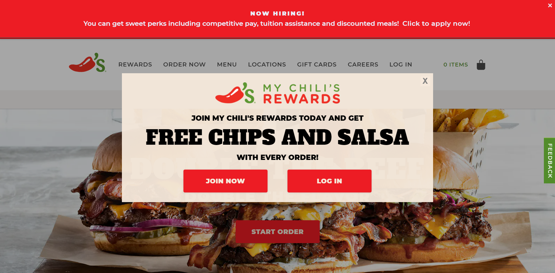
Notice how the background of Chili's welcome popup message contrasts the burgers? That's what I'm talking about.
It makes it easier to spot the popup box. You can also see the brand identity and how they limited the buttons to two only. Not overwhelming, which makes it more appealing.
Now that you know what I'm talking about, let's go to the next one.
4. Have An Enticing Call-To-Action
Don't miss out!
Okay, I just gave you an example of a call-to-action.
But... what I'm talking about is making sure that your call-to-action will make your visitors sign up for your newsletter. Or try your offers. It depends on whatever it is you're trying to achieve with your website popup message.
So, let me give you a few tips.
- Be creative. You can do so much better than "Yes" or "No." You can try being more creative to convert more customers!
- Place your call-to-action buttons in the right place. The placement of your call-to-action buttons is essential. Let's say you have two options, which are yes or no. Some of your visitors think that 'Yes' should be on the left button. But if you put it in the right place, it might get confusing for them.
- Take advantage of the sense of urgency. Don't be afraid to use words like "Now!" or "Today!" Visitors have a fear of missing out, so these are helpful.
But how are you going to make your visitors take action... if you can't persuade them in the first place?
Let me help you because my next tip is...
5. Write A Compelling Copy
Do you really need to write a compelling copy for your website popup message?
The answer is... YES!
Converting your website visitors is achievable... if you write a copy that would help you.
So, how to write a compelling copy? I have a few tips!
- Be clear on what you offer. A website popup message doesn't have to be long. So, get straight to the point.
- Use your tone of voice. Having a welcome popup doesn't mean you need to be formal. You can use your tone of voice. This will help you communicate with your visitors more effectively.
- Add proof. To write an effective copy, try to add some proof. For example, you want to capture leads for your newsletters. You can add the number of your current email list for proof, like "Join the 50,000+ others!"
Another one is...
6. Make It Mobile-Friendly
Popups should be mobile-friendly, too.
This is important if your customers are visiting your websites using their mobile devices.
If they visit your website and they see a welcome popup message that is hard to navigate... they might just bounce off your website.
I'm sure you don't want that to happen, so...
- Choose a mobile-friendly theme. If you have a mobile-responsive theme, it's easier to optimize your website popup message for mobile devices.
- Have larger fonts. To make it easier to read for your visitors, adjust the fonts. Remember, mobile screens are smaller!
- Make your buttons clickable. Make sure that your website visitors can click the buttons properly, especially if they just want to browse your ecommerce store.
And last but not least...
7. Choose A Great Popup Add-On
This is very important when creating your welcome popup message.
Just think of this...
Having a Shopify theme that also allows you to add a newsletter popup? Heaven-sent!
This is why I think you need this to create an effective website popup message.
So, what makes a great popup Add-On?
- You can choose the timing. A great Popup Add-On lets you choose when do you want to show your popup message to your visitors.
- Customizable. You need a popup that's easily customizable. Why? So you can optimize your website popup message based on your messaging, brand identity, call-to-action buttons, etc.
- Easy to manage. After setting up your popup button, of course, you need to manage everything in one place. If you're using the Debutify theme, you can manage it on your Shopify dashboard once someone signs up for your newsletter.
Wait... I have an answer that checks all these boxes...
Debutify is a Shopify theme that offers a newsletter popup. The best part? Easy to customize and manage!
See? You don't need to spend so much energy on making one! And you can also manage everything without hassle.
Now, let me show you some brands with popups that #NailedIt!
3 Brands With Popups That Are Smashing It
1. Nike

This is one of my welcome popup examples. Nike's website popup message stands out because the box distinguishes itself from the background. You can also see their tiny logo and brand's font.
Not only that, because the copy is short but straight to the point. There's not much happening, and there are only three answer fields.
This makes it easier for their visitors to interact with their website popup message.
Now, let's see my next example!
2. Shein

Look at Shein's welcome popup message for their website visitors who haven't signed up yet.
The color red is contrasting with the black banner. But do you know what's more enticing for their visitors to convert into customers? The discount codes!
Yes, discount codes. On the website popup message...
Looks exciting, right?
3. Laura Mercier

Laura Mercier makes sure that they incorporate their brand identity into their website popup message! See the beauty products?
You can also see the call-to-action in black, an inviting copy, and a discount offer. This looks like a great welcome popup message!
Now, tell me this wouldn't make their visitors want to order ??♀️
These welcome popup examples tell you to...
Boost Your Conversion Rate!
They're not thinking short-term with their welcome popup messages...
These brands make sure their popups are actionable, not just nice to the eyes.
And let me be honest with you...
If you have a functional website theme that allows you to add a welcome popup message without the hassle...
You can totally do this to your brand, too!
I'm not joking! A fast-loading, mobile-responsive theme... with a highly customizable newsletter popup?
You can find it in one place on the internet!
Debutify is a clean code theme with 50+ Add-Ons to help you achieve your goals!
Good news? You can try it FREE for 14 days!
Skyrocket your conversion rate with Debutify Reviews- Today!
14-Day Free Trial. 1-Click Installation. No Credit Card Required.