E-commerce Tips & Tricks

4 min read

29 Oct 2024

Why Every eCommerce Store Needs a Shopping Cart Progress Bar

Why Every eCommerce Store Needs a Shopping Cart Progress Bar

70.19%. That's the average cart abandonment rate based on recent studies. That's a huge loss for eCommerce businesses.

As eCommerce store owners, you need to think of a solution to minimize or prevent this from happening. Imagine walking into a physical store, filling up a cart, then leaving it at the checkout and walking away.

That's what's happening online every day. But what if I told you that a shopping cart progress bar could make a big difference in getting customers to complete their purchases?

That's precisely what we'll discuss in this article. We'll dive into what a shopping cart progress bar is, why it's so important, and how it works to boost your sales.

We'll also offer some practical design tips to get the most out of it. By the end, you'll see why adding a shopping cart progress bar to your store is a no-brainer.
What Is a Shopping Cart Progress Bar?

What Is a Shopping Cart Progress Bar?

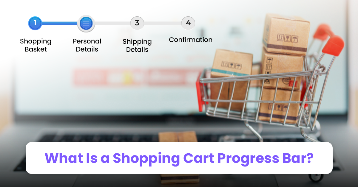
First things first, what is a shopping cart progress bar? In simple terms, it's a visual indicator that shows your customers how far along they are in the checkout process. It usually appears at the top of the page during checkout and moves forward as the customer completes each step.

But there's a specific type of shopping cart progress bar we're talking about today. We'll talk about shopping cart progress bars that nudge customers to complete their purchases by offering rewards.

These rewards can be free shipping, discounts, or even a free gift when they spend a certain amount. This type of progress bar motivates shoppers by showing them how close they are to unlocking a reward.

It sounds simple, right? Yet, it's incredibly effective at reducing cart abandonment and improving sales.

The Psychology Behind Shopping Cart Progress Bars

Here's the thing: people love to feel in control. Shopping, especially online shopping, can sometimes feel a little out of control. It can be stressful when you can't touch or feel the items, and you're unsure of how long the process will take. That's where the shopping cart progress bar comes in.

Progress bars tap into a couple of important psychological concepts: goal gradient theory and loss aversion.

Let's start with the goal gradient effect. According to the goal gradient effect, as a task gets closer to completion, people work harder and are more driven to achieve it.

Imagine a marathon runner who speeds up when they see the finish line. The same thing happens in online shopping.

When customers see how close they are to a reward, they feel an extra boost of motivation to finish their purchase. A shopping cart progress bar visualizes that "finish line." It encourages shoppers to complete their transactions as they inch closer to their goals.

Then, there's loss aversion. It simply states that people are more motivated to avoid losing something than to gain something of equal value.

In the context of eCommerce, once customers see they're close to a reward, they feel like they've already earned part of it. Abandoning the cart and missing out on free shipping or a discount suddenly feels like a loss. This discomfort drives them to complete the purchase rather than give up the perceived gain.

Together, goal gradient theory and loss aversion make the shopping cart progress bar a powerful tool.

Why Add a Shopping Cart Progress Bar?

Why Add a Shopping Cart Progress Bar?

So, why add a shopping cart progress bar to your eCommerce site? Here are a few compelling reasons:

1. Reduces Cart Abandonment

Let's face it: shopping cart abandonment is one of the biggest challenges in eCommerce. As mentioned earlier, about 70% of carts get abandoned. That's a lot of potential revenue slipping away. By showing customers how close they are to a reward, you give them an extra push to complete their purchase.

2. Increases Average Order Value (AOV)

A shopping cart progress bar can encourage customers to add more items to their cart to reach a specific goal. For example, your customer is at $40. If you offer free shipping for orders over $50, they're likely to add an extra $10 worth of items to get that free shipping. It's a simple yet powerful tool to increase AOV.

3. Enhances User Experience

A progress bar makes the checkout process feel more transparent. Customers know exactly how many steps they have left or how close they are to getting a reward. This reduces uncertainty and improves the overall shopping experience. When shopping feels easy and predictable, customers are more likely to come back.

4. Builds Trust

A clear progress bar helps build trust with your customers. They can see that the end is near, and there are no hidden steps or surprises. Trust is crucial for conversions, especially if you're selling high-ticket items.

5. Creates a Sense of Urgency

Progress bars can also create urgency by showing limited-time offers. For example, "Spend $50 in the next 10 minutes and get 20% off." Urgency combined with visual progress can drive customers to complete their purchases quickly.

Practical Tips for Designing Your Progress Bar

Now that we know why you should add a shopping cart progress bar, let's talk about how to design one that works.

1. Keep It Simple

Your progress bar should be easy to understand. Avoid overloading it with too much information or too many rewards. Focus on one or two incentives, like free shipping or a discount.

2. Use Clear and Compelling Language

Make sure the language in your progress bar is clear. For example, instead of saying, "$10 to go," say, "Spend $10 more to unlock free shipping!" Use action-oriented language that encourages shoppers to keep going.

3. Make It Visual

A progress bar is, at its core, a visual element. Use bright colors and clear icons to indicate how close the customer is to their goal. If possible, animate the bar to make it dynamic and engaging.

4. Incorporate Incentives

The most successful shopping cart progress bars offer something valuable in return. Free shipping is a popular incentive, but you could also offer a discount, free gift, or loyalty points. Make sure the reward is visible and appealing.

5. Test and Optimize

Like any other part of your website, your shopping cart progress bar should be tested and optimized. Run A/B tests to see what colors, language, and incentives work best for your audience.

The Power of a Shopping Cart Progress Bar

At the end of the day, a shopping cart progress bar might seem like a small addition to your eCommerce site, but it packs a serious punch. In fact, just a small visual nudge can make the difference between a lost sale and a happy customer.

So, why not give it a try? You can start with the Debutify Theme's Cart Goal widget. This widget allows you to offer free shipping upon reaching a specified amount.

Together with other widgets, you'll be able to create a store that's ready to maximize conversions and keep customers engaged throughout the shopping journey.

Author profile image

Author

Rhea Diamante

Rhea Diamante is a copywriter at Debutify, where she crafts compelling and engaging content. With a knack for storytelling and a keen eye for detail, she ensures every piece she writes resonates with the audience and drives results.

Share post

Similar posts

B2B Video Marketing: The Complete Guide

video marketing

7 min read

B2B Video Marketing: The Complete Guide

Rhea Diamante

Rhea Diamante

What Is Customer Experience Design?

Website

6 min read

What Is Customer Experience Design?

Rhea Diamante

Rhea Diamante

Do's and Don'ts When Choosing Dropshipping Store Names

Dropshipping

5 min read

Do's and Don'ts When Choosing Dropshipping Store Names

Rhea Diamante

Rhea Diamante

Scale your brand effortlessly with Debutify