A beautiful website? And a great website functionality?
Who said you couldn't have it all?
What if I tell you that you can have the best of both worlds?
Yes, you're reading it right.
You can make a beautiful website without sacrificing its functionality.
Feel like I'm exaggerating?
Then read the blog all the way through because...
I will teach you how to develop a website even if you're not a website designer!
But first, let me show you...
Why Do You Need A Beautiful and Functional Website?
1. Customer Experience
Your customer experience impacts the performance of your business.
Creating a professional website no longer requires extensive design or development experience. An AI website builder can help businesses generate layouts, customize pages visually, and launch responsive websites faster while maintaining a strong user experience and consistent branding.
That's why when you give your customers a memorable experience, they will come back to you. And the same thing happens to your website, too.
So, if you have a beautiful website theme, expect them to love it. Because if they do, they will be your loyal customers and brand advocates.
Another benefit of a beautiful and functional website is...
2. Improves Trust And Credibility
Let me ask you this...
What if you want to buy a phone online? And the website doesn't look pleasant at all.
The designs are all over the place and the photos are terrible.
Would you give them your hard-earned money?
If not, then your customers feel the same. If your website doesn't look beautiful or functional, don't expect them to trust you.
And to top it off...
3. Converts Your Visitors Into Customers
If your website functionality is A+...
Your customers will hit 'Check Out!'
If you give them a beautiful website that is easy to navigate, your website visitors can convert into paying customers.
So, I know you already want to know how to do that.
I won't keep you waiting. Let's dive into action!
7 Guaranteed Ways to Build A Website That Will Take Your Customers' Breath Away
1. Easy Navigation
If your customers have a hard time navigating on your website, don't expect them to stay and make a purchase.
Here are a few things to keep in mind when making your navigation:
- Make it clear. Use simple words like "About Us" or "Categories" so they can easily understand.
- Put your navigation bar where your customers can see it immediately. This can be on the top or anywhere easy to find, depending on your website theme.
- Add a great CTA or Call-To-Action. Your customer is on your website to buy your products or services, that's why you need to point them where they can do this.
Let me give you an example:

As you can see here, Debutify's navigation bar is clear. That means potential customers don't have a hard time navigating to find what they need from our website.
You can also see the Call-to-Action, which prompts our visitors to Try Debutify for Free.
See, easy navigation goes a long way, right?
Let's get into the next one!
2. Have High-Quality Images
Images attract your potential buyers' attention.
Come to think of it...
Would you buy from a website if you don't even see their products properly?
That's how it works for your prospects, too. And having images will help them in their purchasing decisions.
Let me give you some tips:
- Compress images. Large images tend to slow down websites. And having high-quality images doesn't mean you will sacrifice your website functionality.
- Use alt text. Using alt text in your images can improve your search ranking and website's accessibility.
- Use relevant images. Do not put too many photos that have nothing to do with your products or other parts of your website.
I have an example:

Kate Spade invests so much in its product photos. And we can clearly see it on their website.
Look how you can view the inside of the bag through your screen. This makes shopping so much easier for their customers, right?
But that's not the best part yet... because you can actually zoom in on the photos and see the fabric and other details!
I know it sounds amazing, and you can totally do it for your customers too!
My next tip is...
3. Keep It Simple
Did you know those simple websites are scientifically better?
It's because simple websites don't require our brains and eyes to process a lot of information.
And according to cognitive fluency, our brains want things that are easy to think about. Hence it also affects the decision process of your customers.
So, if your website is simple and there are no unnecessary details, you're helping your customers know which step to take.
Here are a few tips on how to keep your website simple:
- Don't use too many fonts. You can use attractive fonts, but make sure they're easy to read. And don't use more than three fonts.
- Use whitespaces. This means you need to have spaces that have no image or text. This will not overwhelm your customers overwhelmed with many designs happening in the background.
- Don't put unnecessary elements. If it doesn't have anything to do with your products, don't even add it. Let's say for your header, just put one or two that will showcase what your store sells.
Let me give you an example of a simple website.

Chanel has a very simple website. If you go to their website, you can see that everything you need is on the first page.
You can choose from different categories, such as fashion, jewelry, watches, makeup, skincare, etc. And at the bottom, you can also see the navigation. The whitespaces are obvious, too.
If you're trying how to design a Shopify website, they have a lot of simple and customizable themes to choose from!
Remember, website functionality over anything.
Another valuable tip I have for you is...
4. Use Consistent Color Palettes
Your website colors are not just to make your website beautiful.
It's also a part of your entire brand identity.
This will help you stand out because your customers can easily identify your brand if you're using consistent color palettes on your websites and other platforms.
Tips on choosing colors for your website:
- Integrate with your logos. If you already have your logos, then you can incorporate those colors with your website. This will make your brand identity stronger.
- Study color psychology. This is important for your customers because colors play a big role in how they perceive your brand. So, make sure to study color psychology because this will also help you establish your brand presence.
- Make it unique. If you want to stand out, make your color palette unique! This will help your customers remember you.
I'll give you an example of a brand that makes sure its brand identity is always intact.

Who wouldn't know Pepsi's brand colors? This is one way to establish their brand presence online.
You can see that the color palette of their website revolves around red, blue, and white. Which are their primary colors.
So, let's say you're learning how to design a Shopify website. Eye-catching colors should be in mind!
Now, let's get into the next one!
5. Write A Compelling Copy
If you have a bit of an idea on how to develop a website, you probably already know this.
Let me explain it further.
Your copy tells your customers what you do. And it should answer their questions...
- How can you help me solve my problem?
- When can you solve it?
- What can I benefit from it?
Let's have an example of a compelling copy.

One Week Website addresses their customers' problems. It also established their expertise because they mentioned that they have more than a decade of experience.
Not only that, but they also promise their customers to grow their business.
So, how do you write a compelling copy?
- Don't use jargon. Your customers wouldn't understand industry jargon. If you want to communicate your brand, use words that they can easily understand from the get-go.
- Speak to your audience. It depends on your brand's tone of voice, but make sure to write as if you are just speaking to your potential customers.
- Be straightforward. Don't write unnecessary words. The shorter, the better.
Already know how to create a compelling copy for your website?
Let's have more tips on how to improve your website functionality.
6. Make It Mobile-Friendly
Did you know that mobile ecommerce sales are expected to reach $3.56 trillion in 2021?
That's huge!
It just proves that more and more people are using their mobile devices to shop, and there's a high chance that would come across your website using it.
So just imagine how much money you can lose if you don't make your website mobile-friendly.
That's why I have some tips for you!
- Have a mobile-responsive theme. If you don't know how to build a beautiful website using HTML, you can start with a mobile-friendly theme.
- Use easy-to-read fonts. Remember, mobile screens are smaller than desktops. So you need to make sure that your fonts' readability is okay.
- Reduce pop-ups. Again, mobile screens are smaller. And if your customers encounter a lot of pop-ups and have a hard time closing them, don't expect them to explore your website more.
But... what if you don't know how to make a beautiful website using HTML?
You're lucky! Because some website makers have mobile-responsive themes, like Wix, Shopify, and Squarespace.
And last but not least...
7. Fast-Loading Speed Is A Must
Did you know that 53% of your website visitors will leave your website within three seconds?
That doesn't sound nice at all!
But that's why you need speed optimization. To make sure that your page loading speed is great.
So, how to optimize your website even if you're not working with a website designer?
- Optimize your images. As I said above, large images affect your page loading speed. Your website maker also notes what's the recommended size for the photos. So make sure to compress them!
- Don't use unnecessary plug-ins. If you have a lot of plug-ins, this might put your website speed at risk. What you can do is limit your plug-ins to what your website and customers need.
- Test your page speed. Speed optimization is a great way to enhance your customer experience. That's why you need to test your page speed every once in a while.
You didn't expect that, right?
But wait, there's more! I will show you how some brands are smashing their website game!
3 Websites That People Love
1. Apple

Apple's website is sleek and simple.
You'll notice that it uses whitespaces and high-quality images to showcase the features of its new iPhone 13 Pro.
You can also see that the copy is creative and direct. No fluff, just "Oh. So. Pro."
And... it's easy to navigate too! You can find everything you need on their navigation bar. No need to navigate elsewhere.
Let's take a look at another one...
2. Woven Magazine

Woven Magazine, according to its website, celebrates artists, designers, and entrepreneurs.
Their website has not much going on, which is an eye-relief. You can see a simple header, title, and a Call-to-Action.
You can also see the Shop button at the top left, which makes it easy to notice. And again, the use of whitespaces.
Now, on to my last example.
3. Dior
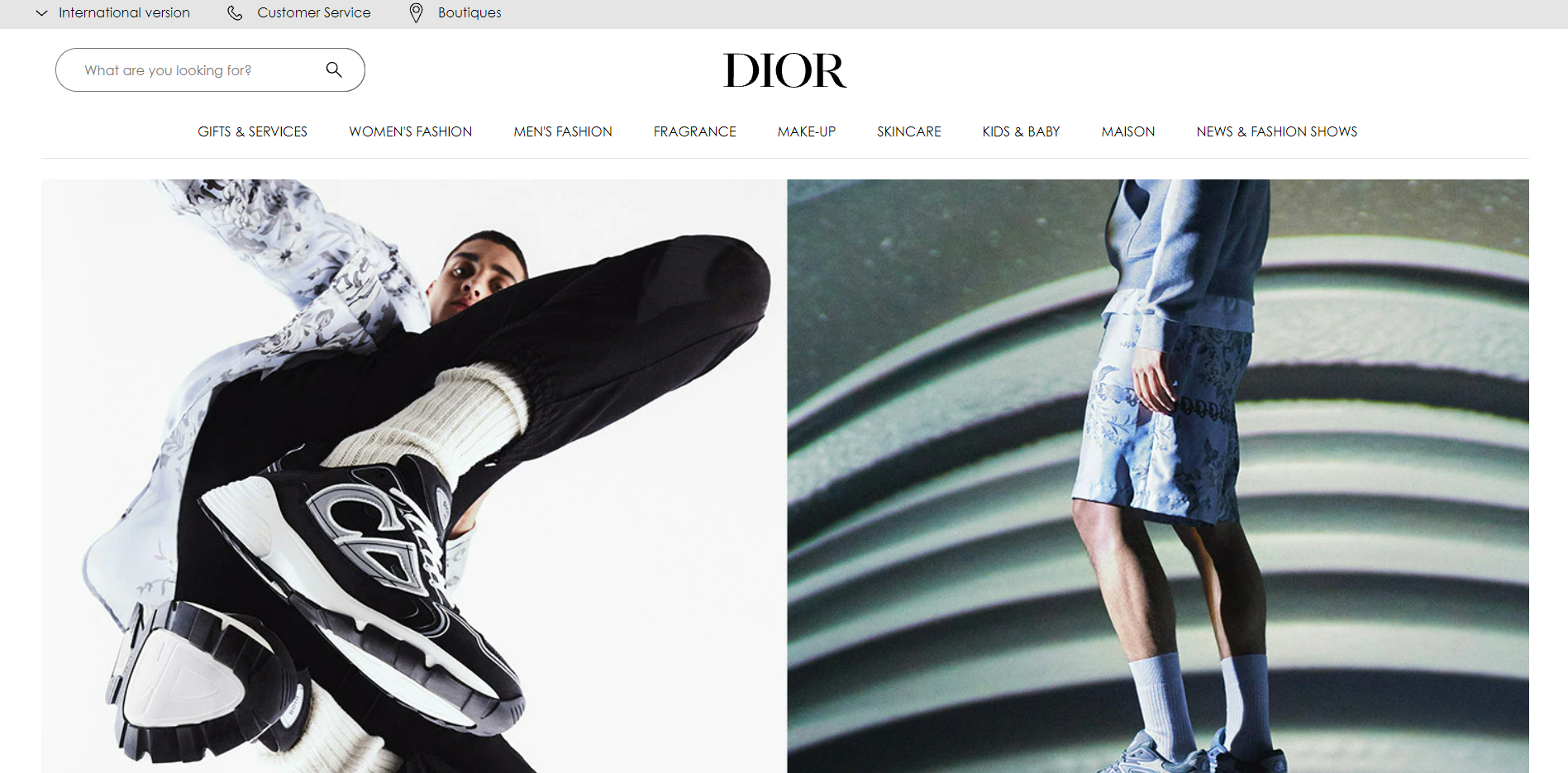
Dior is a well-known brand. Some of their items are even flashy, but that's contrary to their website.
They focus on website functionality. There are the photos their customers need to see, the categories on top, a search bar, and of course the whitespaces.
These look amazing, right?
What if I tell you that you can do this too?
Create A Beautiful Website Now!
Yes, you can do this even if you don't know how to develop a website...
And you can also make sure that it's functioning well, even if you don't know how to create a beautiful website using HTML!
You just need to choose a theme that you can easily customize, depending on your style.
And because you're a business owner, you need to put your customers first!
That's why Debutify offers a theme that is beautiful AND functional.
We also have 50+ add-ons to make your website even more eye-catching and conversion-friendly!
If you don't believe me, you can try Debutify FREE for 14 days!
Create a Website Your Customers Will Love. Try Debutify Free - Today!
14-Day Trial. 1 Click Installation. No Credit Card Required.