What if you can shoot 100% of the time in basketball?
Or, what if you can cook your favorite meal perfectly all the time?
Now, that's absurd, right?
But what if you can do that with your ecommerce store?
Specifically, what if your checkout page can convert almost every potential customer?
Well, hold your belt tight.
And today, we are going to talk about improving your checkout page.
I'm not saying your current checkout page is bad...
But you can definitely improve it and make it MORE HIGH-CONVERTING!
So, if you want to make more sales...
You need to finish this blog because you're going to learn ways how to create a high-converting checkout page.
Are you ready? I won't keep you waiting!?
Why Do You Need An Optimized Checkout Page?

To Increase Your Sales
If your checkout page gives your customers a hard time... they might leave your website. Or worse, go to your competitors.
But when you have an optimized website and checkout page, gaining customers is easier. Because they can navigate your website smoothly, and purchase the products they like without hassle!
Also, having a checkout optimization can help you increase your conversion by 35.62%!
Another reason why you need an ecommerce checkout optimization is...
To Enhance Customer Experience
Did you know that you can capture more customers by optimizing their customer experience?
In fact, according to study, 65% of customers want to buy from businesses that offer them easier transactions.
Not only that... but if you give them a great experience, you might even retain and have them as your loyal customers.
But here's another incredible reason why you should go hard in your ecommerce checkout optimization...
To Reduce Cart Abandonment Rate
Did you know that 18% of online shoppers abandon their cart if the checkout process is too long?
So, having an optimized and simplified checkout page can help you reduce your cart abandonment rate.
I'm sure you want to get to the best part, so here are the solutions to your question "how do you improve my checkout page?" ?
7 Essentials In Creating A High-Converting Checkout Page
1. Have A Simple Design Page

A simple design page lessens distractions. It helps your customers focus on one thing only, and that's processing their orders.
So, how can you achieve a simple checkout page design that converts?
One way to do this is by not using too many colors, fonts, and other visual elements that might create confusion and distraction.
Keep it simple and straightforward. If there are so many things happening, your customers might feel overwhelmed.
Another is by keeping the forms they have to fill out at minimal.
If you see that some information is not relevant to their purchase, payment, delivery, and shipping concerns, feel free to remove the fields.
Because filling out too many forms might trouble your customers.
And because of this, they might just leave their carts without transacting with you. We don't want that, right?
The key to having a high-converting checkout page is to be direct with its purpose. And a simple checkout page is one of the answers. ?
Oh, and speaking of simple checkout design... the following advice can work hand in hand with it.
2. Create A Single-Page Checkout Process
There are different types of checkout pages: Multi-page and single-page checkout pages.
So, what's the difference?
A multi-page checkout shows the different stages before you can complete your transaction. It means you have to accomplish each page before you can get to the next one.
Here's what it looks like:
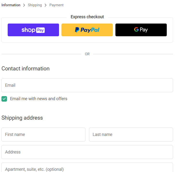
(Source)
As you can see, users have to fill out the information first before they can go to the shipping and payment pages.
Multi-page checkouts also have their own benefits. And one of them is giving users an overview of the whole process they have to take before completing their transaction.
But a single-page checkout is common in most ecommerce stores, and here's why:
- It's convenient. Unlike in multi-page checkouts, everything is on one page. So, it's easy to get an overview of the details.
- It's faster. Since everything is in one place, completing the transaction is faster. And this results in a higher conversion rate.
- It doesn't need an extra loading time. It means that if customers need to check on the details they input, there's no need to go back and wait for the page to reload.
It actually depends on what you prefer, but you should always keep in mind what's best for your customers.
And it's important to keep their user experience in mind when creating your checkout page.
Now, the next one is more on maximizing your sales...
3. Let Them Checkout Without An Account
Did you know that 23% of online shoppers abandon their carts if they're required to create an account on your ecommerce store?
In other words, you need to allow guest checkouts.
Creating an account on your ecommerce store might take a few minutes of their time. But not everyone is willing to do that.
That's why you should enable guest checkouts on your ecommerce store if you want to reduce your cart abandonment rate.
Here's an example from Nike's checkout page.
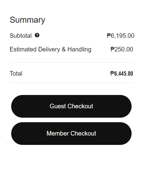
Nike allows guests or members to check out their orders. And this is convenient, especially if there are users who aren't Nike's regular shoppers and don't need to create an account.
Aside from letting your customers purchase without an account, another thing you need to do is...
4. Make Your Checkout Page Mobile-Responsive
A mobile-responsive website is a must.
I mean, 90% of internet users use their mobile devices to use the internet... So, your checkout page needs to serve your mobile users, too.
That's huge, right?
Now, how can you achieve this?
- Optimize the buttons, texts, and display sizes for mobile. This means you should adjust the size as mobile users have smaller screens.
- Install a mobile-friendly theme. Well, this is pretty much the easiest solution. You can just download an ecommerce theme that works well for mobile users.
- Make it simple. As I said above, too much distraction is not good on your checkout page. What more if the mobile checkout page is overwhelming and they have to scroll past or exit a lot of banners or popups using their small screens?
But mobile optimization doesn't stop there. You need to test every once in a while to ensure your customers are having a great shopping experience.
Another ecommerce checkout optimization you need to do is...
5. Optimize The Buttons
Newsflash: Buttons affect the buying decision of your customers!
Yep, it needs superb optimization before they hit it.
So, what does this mean? This means your buttons should be clear of what it is about.
For example, if you only use the words "Continue" or "Proceed," your customers might not be sure what you're talking about.
It might even confuse or hesitate them into clicking those buttons because they're not 100% sure what's going to happen next. Will you redirect them to the checkout page? Or what?
Another thing you can do, aside from the text, is to customize the buttons.
You can add some colors that pop, or you can make it big. Don't use regular texts with links to the checkout page.
Your buttons need to pop so they'll be easily noticeable!
The next your checkout page design needs is...
6. Add Urgency

If you're wondering yourself, "how can I improve my shopping cart conversion rate?" then creating a sense of urgency is one of the answers to your question.
What are these, anyway?
These can come in many ways, such as:
- Cart Countdown
- Stock Number
- Recent Sales Popup
And many more! You can also use an enticing CTA or call to action to invite more customers to checkout!
The best part? Debutify has these Add-Ons (and more!) that will help boost your conversion rate. ?
So remember, when you're conducting an ecommerce checkout optimization, make sure to add these to your checkout page to make more sales.
Sounds amazing, right?
Now, let's hop on to the last one...
7. Allow Multiple Payment Options
Want a high-converting checkout page? Allow your customers to pay through the payment method they prefer.
The lack of payment options might stop them from purchasing your products.
For example, some customers might prefer cash, especially if it's their first time purchasing from your store. Or, some of them might want to pay using their mobile wallets or bank accounts.
Every customer is different. So, you should be able to provide as many options as you can, such as:
- Credit Card
- Debit Card
- Cash
- Paypal
- Bank Transfers
- Apple Pay
- Google Pay
There are still other options available. And you need to check which ones your ecommerce platform supports.
Now, what?
Ready To Boost Your Sales?
Once you're done optimizing your checkout page, just wait until you see the results!
But you have to remember that optimizing your checkout process needs constant improvements.
Even after following these tips, you still have to make sure you're giving customers an easy, trouble-free checkout process on your ecommerce website.
And before I forget, here's a tip you might need to jot down on your notes.
In case you're planning to revamp or improve your ecommerce store's look this 2022... you might want to use a fast-loading theme that will help you increase conversions!
Because using the Debutify theme, it can help you boost your conversion rate with 50+ Add-Ons!
Try Debutify For Free And Build A Conversion-Magnet Ecommerce Store - Today!
14-Day Free Trial. No Code. No Credit Card Required.