You've probably heard the saying, "a picture is worth a thousand words." Well, in eCommerce, a picture can be worth thousands of dollars.
Shoppable images are the latest tool for brands that want to make shopping easier and more fun. Imagine scrolling through a beautiful lifestyle image, spotting something you love, and buying it right on the spot. No need to switch to another page. That's the magic of shoppable images.
But there's more to creating irresistible shoppable images than just tagging a few products. If you want your shoppable images to stand out and convert visitors into buyers, you need to follow a few best practices. But before that...
What Is a Shoppable Image?
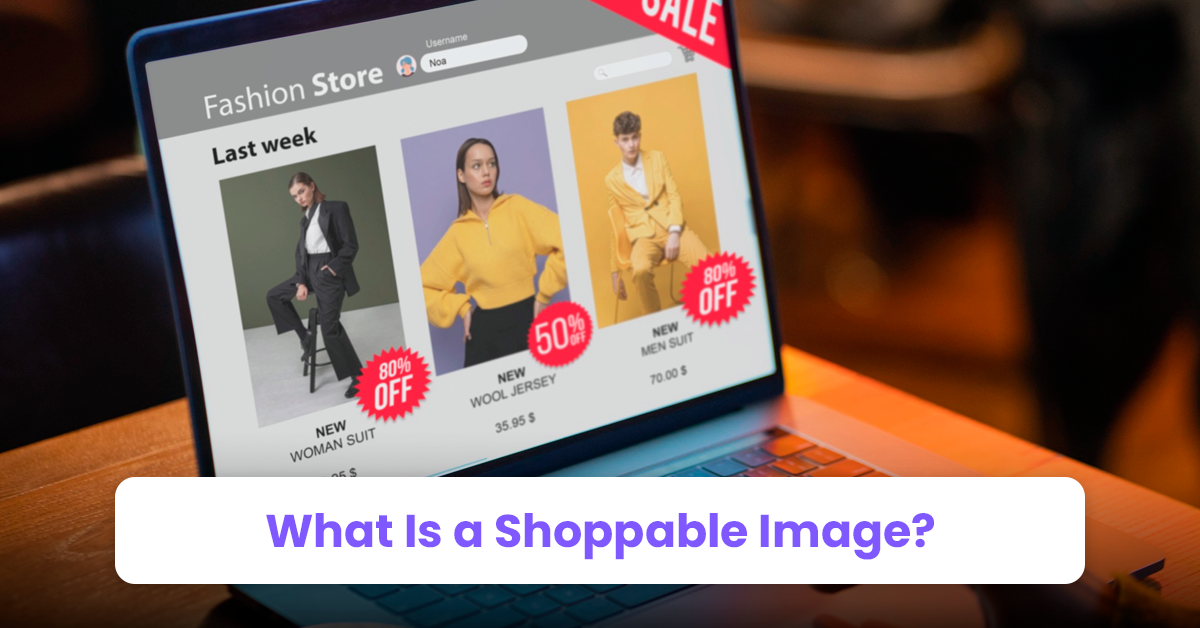
A shoppable image is a picture where customers can click on products they like and buy them right away. Instead of just looking at a pretty photo, they can interact with it.
Each product in the image is tagged, and when clicked, it takes the customer straight to that product's page. It's like turning a regular image into a mini-store.
Shoppable images make shopping easy and fun because they cut out extra steps. Customers see what they want, click, and buy. That's the power of shoppable images.
Now that you know what shoppable images are, let's jump into five best practices for creating irresistible shoppable images:
1. Make It Natural: Context is Everything
Here's a secret: shoppable images should blend seamlessly with the shopping experience. Think about it—when you shop in a physical store, products are displayed in a way that makes sense.
A cozy sweater on a mannequin, a pair of boots next to a pair of jeans. The same logic applies online. You want your shoppable images to feel as natural as possible.
Plus, instead of plain product photos, show your products in action. For instance, if you're selling home decor, show a living room setup with clickable links to each item in the room. It creates a more immersive experience for your customers.
Tip: Use lifestyle shots. People are more likely to engage with a beautiful bedroom scene than a lonely duvet on a white background.
2. Keep It Simple
When it comes to shoppable images, don't go overboard. The goal is to make it easier for your customers to shop, not to overwhelm them. If you clutter your images with too many clickable hotspots, it can confuse people and make them less likely to buy.
Focus on featuring just a few key products per image. A maximum of five clickable items usually works best. So even if your shoppable images Shopify app allows you to add multiple tags, keep it to a maximum of five. This way, you guide your customers toward the items that matter most, without drowning them in options.
Tip: Always keep the user experience in mind. When in doubt, ask yourself, "If I were a shopper, would I enjoy using this?"
3. Clarity Is Key: Make Your CTAs Stand Out
Your shoppable images should leave no room for guesswork. Shoppers should immediately know what to do next. That's where clear call-to-actions (CTAs) come into play. Think of CTAs as signs in a store telling customers where to go next—"Click Here," "Shop Now," "Add to Cart." The same applies to shoppable images.
Be specific and straightforward with your CTAs. Don't just use vague terms like "Learn More." Instead, go for action-oriented phrases that tell customers exactly what they'll get by clicking. "Shop the Look" or "Add This to Your Cart" works better.
Tip: Try experimenting with different CTA placements and wording to see what works best for your audience.
4. Mobile Optimization Is Non-Negotiable
Did you know more than half of all online shopping happens on mobile devices? In fact, mobile commerce sales are expected to hit $710 billion by 2025.
Image source
This means your shoppable images need to be optimized for mobile. So, always check the recommended product image size for best results.
On a smaller screen, every detail matters. Your clickable areas should be large enough for people to tap easily, and your images need to load fast. No one wants to wait for an image to load only to tap the wrong item because the clickable area is too small.
Pro Tip: Test your shoppable images on different devices. What looks great on a desktop might not work as well on a phone, so make sure both versions perform well.
5. Use Analytics to Fine-Tune Your Strategy
Data is your friend. Shoppable images give you valuable information about what your customers like, click on, and buy. Use these insights to improve your images.
For example, if some products are getting lots of clicks but not converting into sales, it could be a pricing issue or a weak CTA. But, if an image is performing well, try using similar setups in other areas of your store.
Pro Tip: Make reviewing your analytics a routine. Regularly check your images' performance and adjust your strategy to keep improving.
Additional tips:
To help amplify the effectiveness of shoppable images, follow these tips:
1. The first thing shoppers see on your product page is the featured image, and it should be nothing short of stunning. A blurry, dull, or poorly lit featured image can turn customers off instantly. Make sure your featured image pops and highlights your product's best features.
2. Want to further highlight a product that's already part of the shoppable image? You can do this by adding an image with text section. Whether it’s a catchy tagline or a brief product description, a little text can go a long way in supporting your visuals.