E-commerce Tips & Tricks

4 min read

17 Jul 2023

Top eCommerce Design Trends for Seamless User Experience

Top eCommerce Design Trends for Seamless User Experience

Unlock the secrets to creating an irresistible online shopping experience with our guide to the top eCommerce design trends. From sleek minimalism to cutting-edge technology, discover how to captivate customers and boost conversions in the ever-evolving world of e commerce and online retail.

This guide will explore the top ecommerce design trends shaping the online retail landscape. From minimalistic design to mobile-first approaches, personalized experiences, to voice search integration, we will delve into each design trend and uncover how they can elevate the user experience and drive conversions.

So, whether you are an established online retailer looking to stay ahead of the curve or a budding entrepreneur venturing into the world of ecommerce, this guide will equip you with the importance of eCommerce design, knowledge, and inspiration to create a seamless user experience that leaves your customers returning for more.

Let's dive into the exciting world of the latest ecommerce design that can bring you sales.

Unlock the secrets to creating an irresistible online shopping experience with our guide to the top eCommerce design trends. From sleek minimalism to cutting-edge technology, discover how to captivate customers and boost conversions in the ever-evolving w

Minimalistic design has become increasingly popular in the ecommerce design trend due to its numerous benefits. Some of the key advantages of implementing a minimalistic design in ecommerce include:

  1. Enhanced User Experience: Minimalistic design focuses on simplicity and decluttering, which helps users to navigate through the website more easily. Users can focus on the key elements and content by reducing visual distractions, resulting in a smoother and more enjoyable experience.
  2. Improved Loading Speed: Minimalistic designs typically have fewer elements and a cleaner code structure, leading to faster loading times. This is crucial for ecommerce websites as slow loading speeds can significantly impact user satisfaction and conversion rates.
  3. Increased Conversion Rates: A clutter-free and visually appealing design can improve user engagement and encourage visitors to stay longer on the website. With a minimalistic design, the focus is on the products or services offered, making it easier for users to purchase, ultimately leading to higher conversion rates.

Simplified navigation and clean layouts

Minimalistic design in ecommerce often involves simplified navigation and clean layouts. This approach aims to provide users with a seamless browsing experience and make finding what they want easier. Here are some key features of minimalistic navigation and clean layouts:

  1. Easy-to-Find Menu: A minimalistic design typically includes a clear and easily accessible menu, usually placed at the top of the webpage. This allows users to navigate to different sections of the website quickly.
  2. Intuitive Search Bar: A search bar is often placed prominently on the homepage to allow users to search for specific products or categories. This helps users find what they need without browsing multiple pages.
  3. Limited Number of Categories: Minimalistic designs often prioritize simplicity by reducing the number of categories displayed. This helps users focus on the most important and relevant categories, making it easier to find products.

Effective use of white space

White or negative space is an essential element of minimalistic design. It refers to the empty or blank areas between elements on a webpage. Here's how effective use of white space contributes to a minimalistic design in ecommerce:

  1. Visual Clarity: White space helps to create a sense of visual clarity by separating different elements and content on a webpage. It allows users to focus on the essential elements and prevents the website from appearing cluttered.
  2. Emphasis on Key Elements: Using white space strategically, ecommerce websites can draw attention to essential elements such as product images, call-to-action buttons, or promotional offers. This helps to guide users' attention and improve the overall user experience.
  3. Improved Readability: White space around text blocks and paragraphs enhances readability by making the content more legible. It prevents text from appearing cramped and overwhelming, ensuring users can easily read and understand the information provided.

Examples of ecommerce websites with minimalistic design

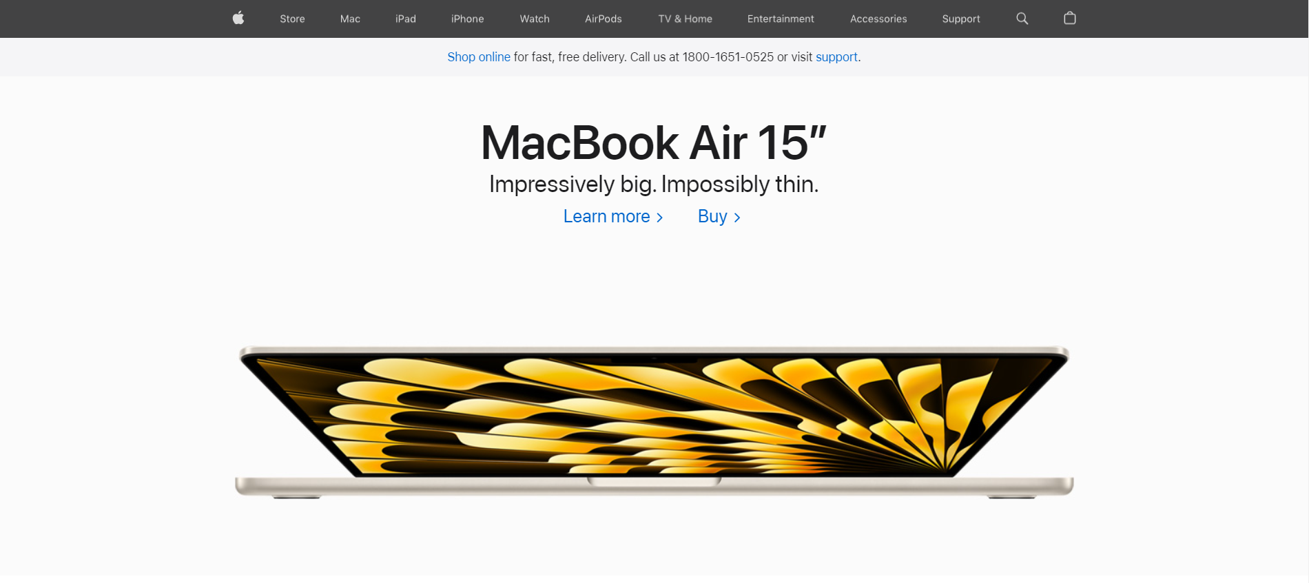
Apple: Apple's website is a prime example of minimalistic design. The clean layouts, ample white space, and focus on product visuals create a sleek and modern user experience.

macbook air 15

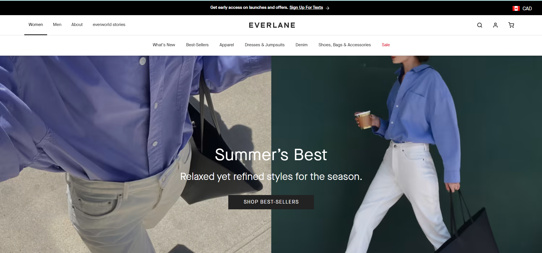
Everlane: Everlane's ecommerce website features a minimalistic design with simple navigation, clean layouts, and a limited color palette. The products are emphasized, allowing users to browse and shop easily.

everlane design

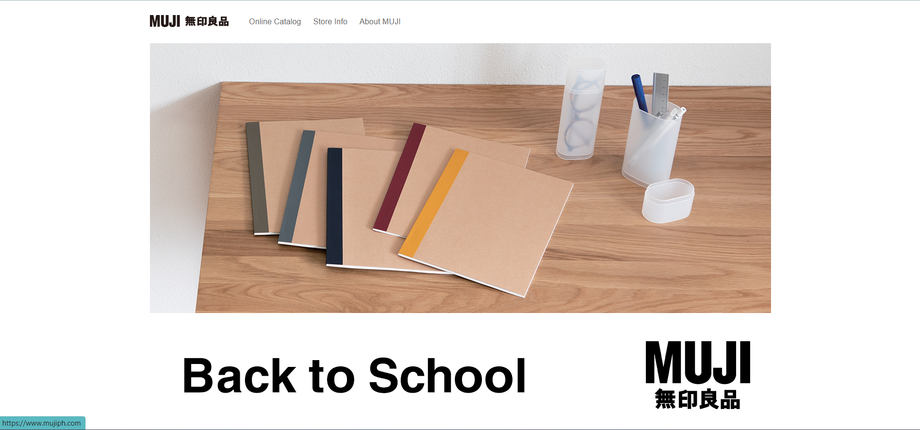
Muji: Muji's ecommerce website follows a minimalistic design approach focusing on simplicity and functionality. White space, straightforward typography, and minimalistic product displays create a clean and user-friendly experience.

muji

These examples demonstrate how minimalistic design can be effectively implemented in ecommerce, providing users with a visually appealing and user-friendly shopping experience.

#2 Microinteractions

Microinteractions are small, subtle, and often overlooked design elements that serve a specific purpose within a user interface. They are the tiny details that make a user's interaction with a product or website more engaging and enjoyable.

The purpose of microinteractions is to provide feedback, guide users, and enhance the overall user experience.

Enhancing user engagement and feedback

It plays a crucial role in enhancing user engagement and providing feedback. They help users understand the system's status, confirm actions, and provide a sense of control.

By providing visual or auditory cues, such as animations, sounds, or haptic feedback, microinteractions create a more intuitive and interactive experience. These small details can significantly affect how users perceive and interact with a product or website.

Examples of microinteractions in ecommerce

In the context of ecommerce, microinteractions can be found in various user interface elements.

For example, when adding a product to the cart, a subtle animation or confirmation message can provide feedback to the user, assuring them that their action was successful. Another example is the use of progress indicators during the checkout process, which inform users about the steps remaining and reduce uncertainty.

Microinteractions can also be found in product galleries or sliders, where users can interact with images by swiping or clicking to view different angles or variations of a product. Additionally, microinteractions can be used to display real-time updates, such as showing the number of items in the cart or the availability of a product.

Best practices for implementing microinteractions

  1. Purposeful and meaningful: Ensure that each microinteraction serves a clear purpose and provides relevant feedback to the user. Avoid adding unnecessary or distracting interactions.
  2. Subtlety and responsiveness: Microinteractions should be subtle, unobtrusive, and responsive to user actions. They should provide immediate feedback without disrupting the user flow.
  3. Consistency: Maintain consistency in the design and behavior of microinteractions throughout the user interface. This helps users understand and predict how interactions will work.
  4. Accessibility: Consider accessibility guidelines when designing microinteractions. Provide alternative ways for users with disabilities to perceive and interact with the interface, such as providing text alternatives for visual cues or using haptic feedback for auditory cues.
  5. User testing and iteration: Test the microinteractions with real users to gather feedback and iterate on the design. This helps ensure that the interactions are effective and well-received.

By following these best practices, ecommerce websites can leverage microinteractions to create a more engaging, intuitive, and user-friendly experience, ultimately leading to increased user satisfaction and conversions.

#3 Personalization and customization

Tailoring the shopping experience to individual users

Personalization and customization are key strategies in ecommerce that aim to provide a tailored shopping experience for individual users.

Personalization starts with understanding the user's preferences, browsing history, purchase behavior, and demographic information. This data can be collected through various means, such as user accounts, cookies, and tracking pixels.

Dynamic content and product recommendations

This can be done through various methods, such as displaying "Recommended for You" sections, personalized product carousels, or email campaigns.

Dynamic content and product recommendations help users discover new products and increase the chances of conversion by presenting them with items that align with their interests and preferences. This level of personalization can significantly improve the user experience and drive customer loyalty.

User-generated content and reviews

User-generated content (UGC) and reviews are crucial in personalization and customization. UGC includes customer reviews, ratings, testimonials, and user-generated photos or videos. Additionally, UGC can be leveraged to personalize the shopping experience.

For example, displaying reviews and ratings from users with similar preferences or demographics can help users find the most relevant products. User-generated content also fosters community and trust, further enhancing the shopping experience.

Implementing personalization effectively

To implement personalization effectively, ecommerce websites should consider the following best practices:

  1. Data privacy and transparency: Obtain user consent for data collection and communicate how the data will be used to personalize the shopping experience. Ensure compliance with privacy regulations.
  2. Relevant and non-intrusive personalization: Personalize the user experience without being overly intrusive. Avoid bombarding users with irrelevant recommendations or promotions.
  3. Continuous testing and optimization: Regularly test and optimize personalization algorithms to ensure accuracy and relevance. Collect user feedback to refine personalization strategies.
  4. Seamless integration across channels: Personalization should be consistent across all touchpoints, including website, mobile app, email, and social media. Ensure a seamless experience for users as they navigate between different channels.
  5. Flexibility and adaptability: Allow users to control their personalization settings and preferences. Provide options to opt-out or modify personalization features.

By implementing personalization effectively, ecommerce websites can create a more engaging and customized shopping experience, leading to increased customer satisfaction, loyalty, and ultimately, higher conversion rates.

#4 Augmented Reality (AR) and Virtual Reality (VR)

Augmented Reality (AR) and Virtual Reality (VR) technologies have revolutionized how consumers interact with ecommerce products. These technologies provide immersive shopping experiences that bridge the gap between online and offline retail.

With AR, users can overlay virtual elements onto the real world, allowing them to visualize products in their environment.

For example, using a smartphone or tablet, customers can see how furniture would look in their living room or how clothing would fit on their bodies. This creates a more realistic and engaging shopping experience, reducing uncertainty in consumer expectations and increasing confidence in purchasing decisions.

On the other hand, VR offers a fully immersive experience by transporting users to a virtual environment.

Customers can explore virtual stores, browse products, and interact with them in a lifelike manner. VR allows for a more interactive and sensory experience, enabling users to examine products from every angle and even simulate using them.

Virtual try-On and product visualization

One of the critical benefits of AR and VR in ecommerce is the ability to try on products virtually. Virtual try-on allows customers to see how clothing, accessories, and even makeup would look on them without physically trying them on. This feature saves time and provides a convenient and risk-free way to make purchase decisions.

Product visualization is another advantage of AR and VR. These technologies enable users to see detailed 3D models of products, explore different color and design options, and even interact with them in real time. For instance, users can rotate, zoom in, or manipulate virtual objects to understand their features and functionalities better.

Examples of successful AR and VR implementations in eCommerce

Several companies have successfully implemented AR and VR in their ecommerce strategies, enhancing the shopping experience for their customers.

One notable example is IKEA's "IKEA Place" app, which allows users to place furniture in their homes using AR virtually.

Ikea App Page

Customers can accurately visualize how the furniture would fit and look in their space, making it easier to make purchasing decisions.

Warby Parker, an eyewear retailer, has also leveraged AR technology to provide virtual try-on experiences. Their "Virtual Try-On" feature allows customers to see how different glasses frames look on their faces using their smartphone's camera. This has significantly improved the online shopping experience for eyewear, eliminating the need for physical try-on.

#5 Fast and secure checkout

Fast and secure checkout is a crucial aspect of ecommerce design that can significantly impact conversion rates and customer satisfaction. By streamlining the checkout process and providing secure payment options, businesses can reduce cart abandonment and create a seamless customer shopping experience.

Streamline the checkout process for improved conversion rates

Streamlining the checkout process involves removing unnecessary steps and minimizing the amount of information required from the user. By reducing the number of form fields and simplifying the overall design, businesses can make it easier and faster for customers to complete their purchases.

This can lead to improved conversion rates as customers are more likely to complete the checkout process when it is quick and straightforward.

One-click and guest checkout options for eCommerce brands

One-click and guest checkout options are effective strategies to expedite the checkout process. One-click checkout allows customers to save their payment and shipping information, enabling them to complete their purchases with just a single click.

Guest checkout, on the other hand, allows customers to purchase without creating an account, eliminating the need for account creation and login. These options reduce friction and make the checkout process faster and more convenient for customers.

Secure payment gateways and encryption

Ensuring the security of customer information during the checkout process is of utmost importance. Implementing secure payment gateways and encryption protocols helps protect sensitive data such as credit card details and personal information.

By partnering with trusted payment providers and displaying security badges, businesses can instill confidence in their customers and increase trust, leading to higher conversion rates.

Reduce cart abandonment through optimized checkout

Cart abandonment is a common challenge in ecommerce, often caused by a complicated or lengthy checkout process. Businesses can address the pain points that lead to cart abandonment by optimizing the checkout flow.

This includes providing clear progress indicators in-store experience, offering multiple payment options, displaying shipping costs upfront, and providing a summary of the order before finalizing the purchase. These optimizations can help reduce cart abandonment and encourage customers to complete their purchases.

#6 Social Commerce Integration

Social commerce integration refers to leveraging social media platforms to enhance the ecommerce experience. By combining the power of social media and online shopping, businesses can reach a wider audience, drive sales, and increase customer engagement.

There are several critical aspects of social commerce integration that businesses should consider:

Leverage social media platforms for ecommerce

Social media platforms like Facebook, Instagram, and Pinterest offer a vast user base and allow businesses to showcase their products or services.

By creating a solid presence on these platforms, businesses can attract potential customers and online shoppers and drive traffic to their ecommerce websites.

Shoppable posts and social media ads

Shoppable posts and social media ads allow businesses to link their products or services to their ecommerce websites directly. This enables users to make purchases without leaving the social media platform.

Businesses can reduce friction and increase conversion rates by incorporating a seamless shopping experience within social media.

User-generated content and social proof

User-generated content, such as customer reviews, testimonials, and social media mentions, is crucial in building trust and credibility.

By integrating user-generated content into social commerce strategies, businesses can leverage social proof to influence purchasing decisions and drive sales.

Integrate social commerce with the ecommerce website

To fully leverage social commerce, it is essential to integrate it with the ecommerce website.

This can be done by incorporating social media login options, allowing customers to share their purchases on social media, and providing social sharing buttons on product pages. These integrations enhance the shopping experience and encourage customers to engage with the brand on social media.

Design a seamless experience!

By embracing these top ecommerce design trends, businesses can create a seamless user experience that attracts and engages customers, drives sales, and promotes brand loyalty.

Staying current with these trends and continuously optimizing the ecommerce website will ensure that businesses stay ahead in the competitive online marketplace.

Author profile image

Author

Diane Eunice Narciso

Diane Eunice Narciso is a content marketer, strategist, and writer who's skilled and passionate about marketing, social media, eCommerce, etc. And is also an expert in sales and business development nurturing strategic partnerships and collaborations.

Share post

Similar posts

B2B Video Marketing: The Complete Guide

video marketing

7 min read

B2B Video Marketing: The Complete Guide

Rhea Diamante

Rhea Diamante

What Is Customer Experience Design?

Website

6 min read

What Is Customer Experience Design?

Rhea Diamante

Rhea Diamante

Do's and Don'ts When Choosing Dropshipping Store Names

Dropshipping

5 min read

Do's and Don'ts When Choosing Dropshipping Store Names

Rhea Diamante

Rhea Diamante

Scale your brand effortlessly with Debutify